 Colour evokes a mixture of emotions and there’s always talk about its psychology.
Talking about evoking responses, I would love for you to test yours as you scroll through the images.
DFS is a UK sofa brand and they recently caught my attention with their gorgeous Spring/Summer 2015 collection.
As you scroll through the images, think what emotions the colours evoke in you and finally which sofa would you choose and why? All will be revealed at the end.
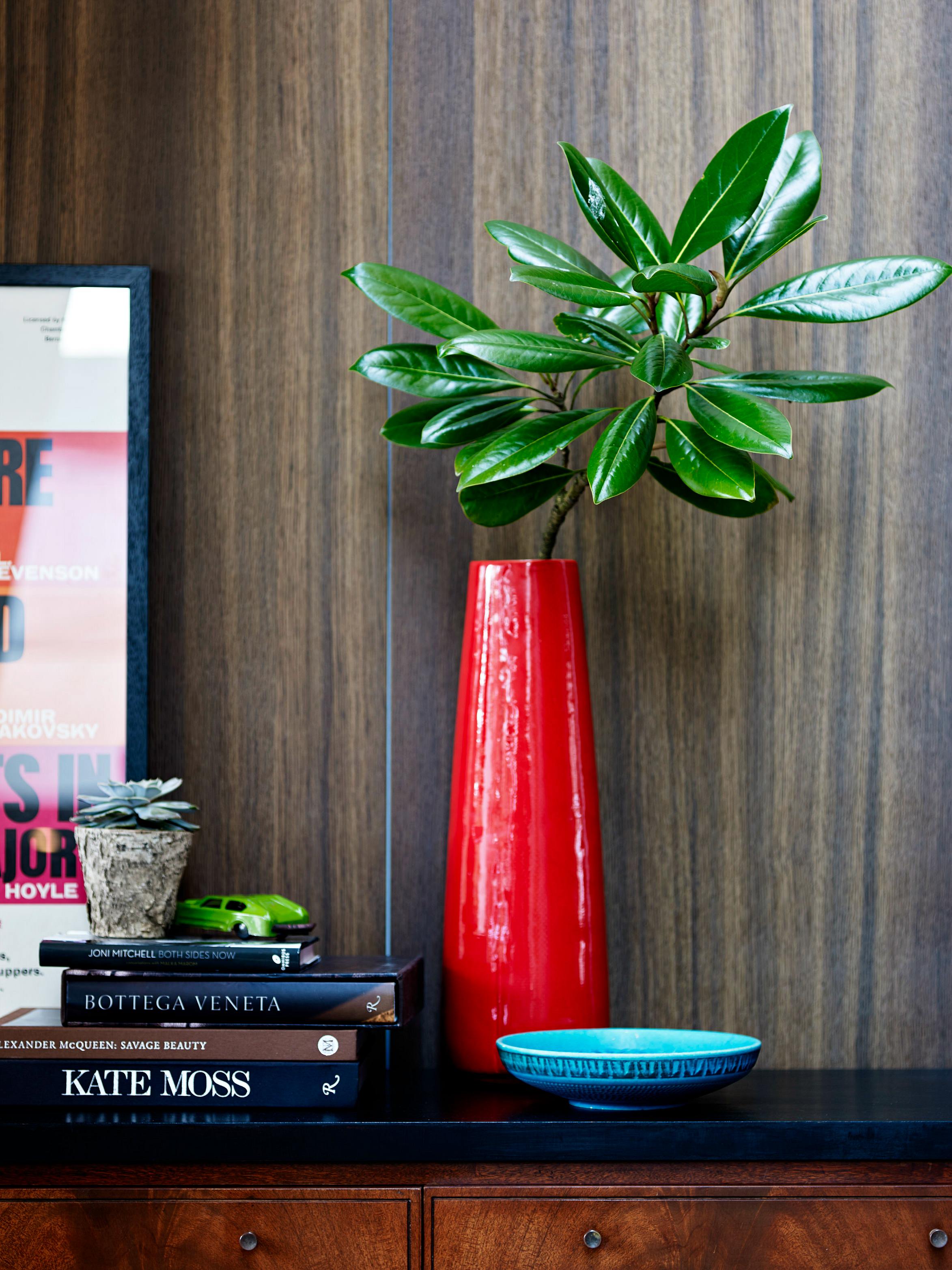
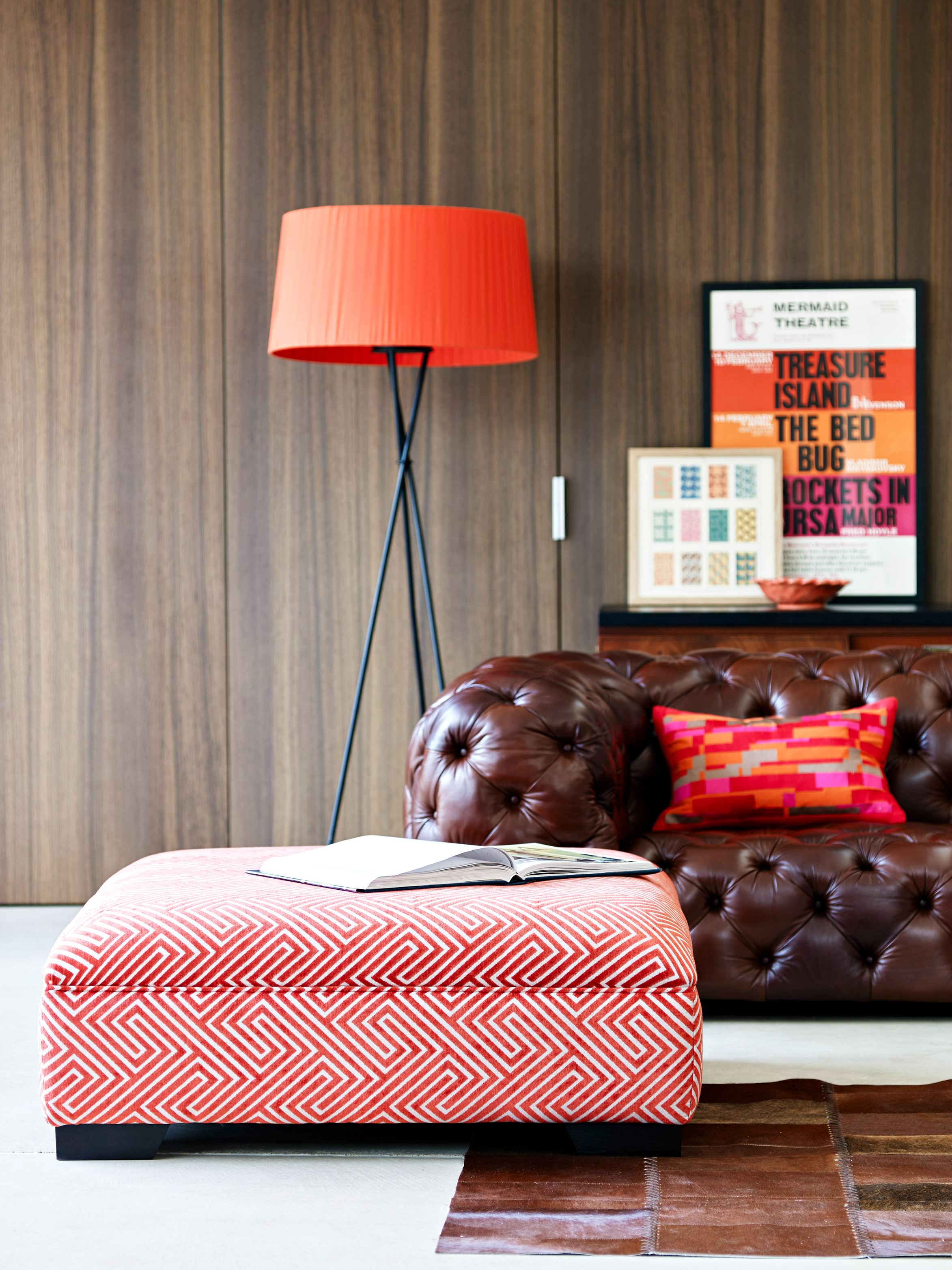 Bright accent colours like orangey reds or fuchsia are the perfect visual lift for a rich chestnut leather sofa.
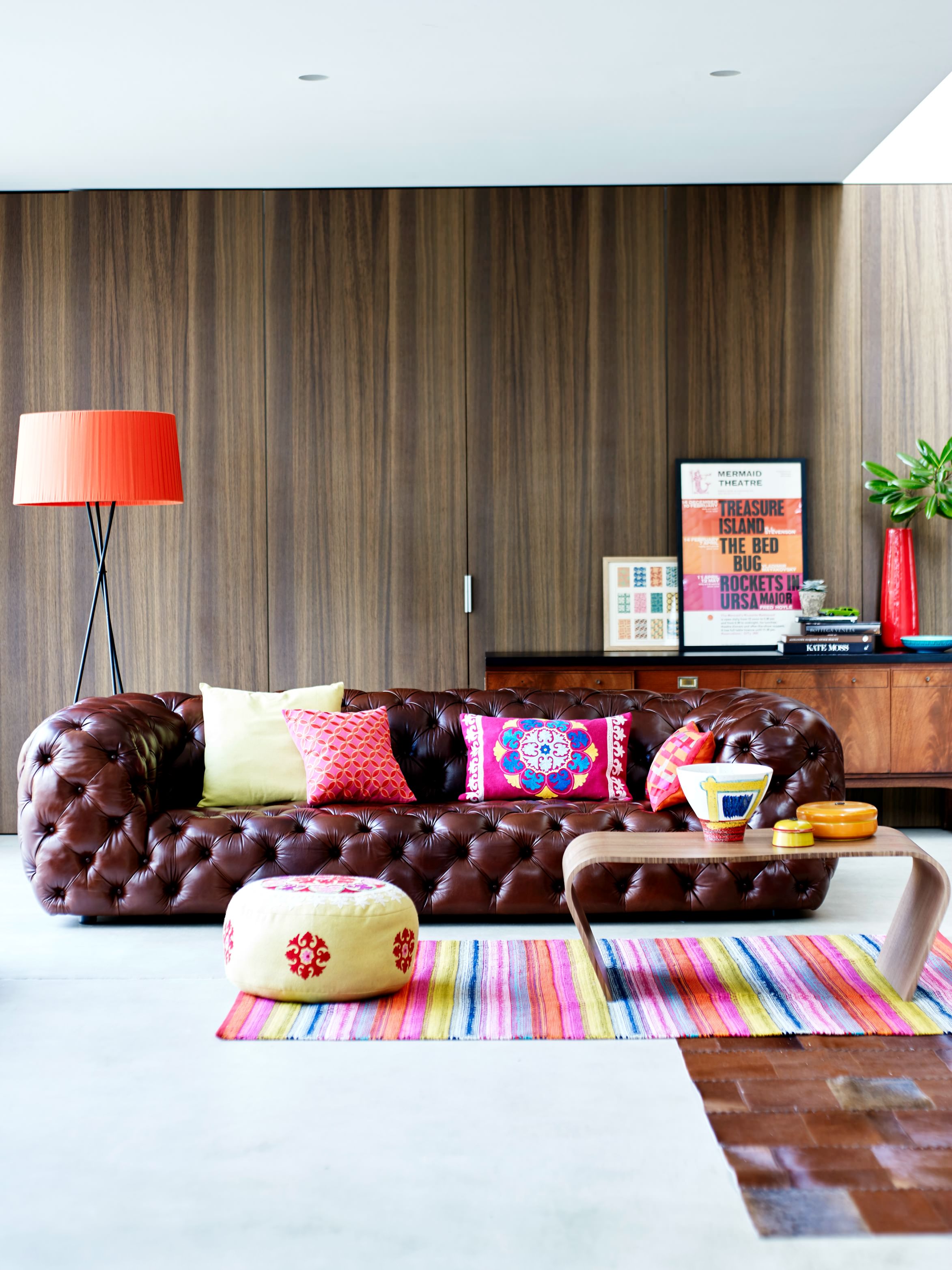
Doesn’t this low level Batoni sofa look so cool? All plumped up with its deep buttons, I’m so ready to dive in and cosy up.
 I remembered when my kids were little, and we wanted to buy a new sofa, we knew we couldn’t go for fabric as you can imagine why.
This would have been the perfect sofa. Stylish yet easy to clean.
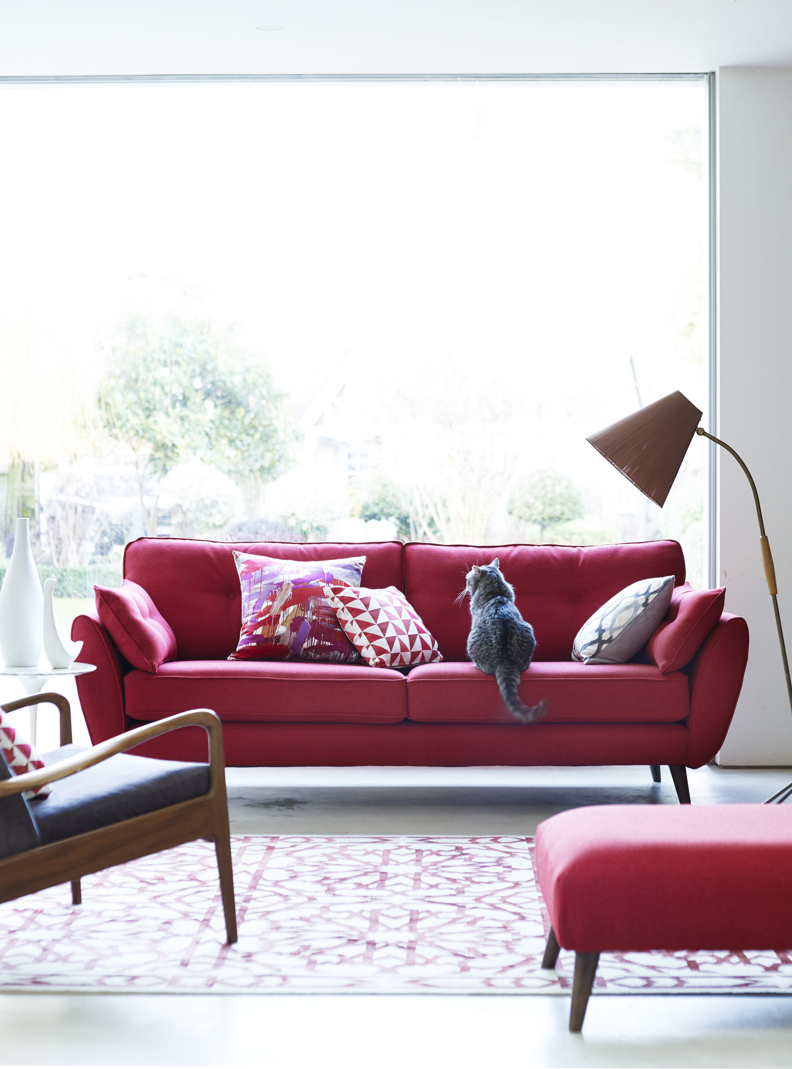
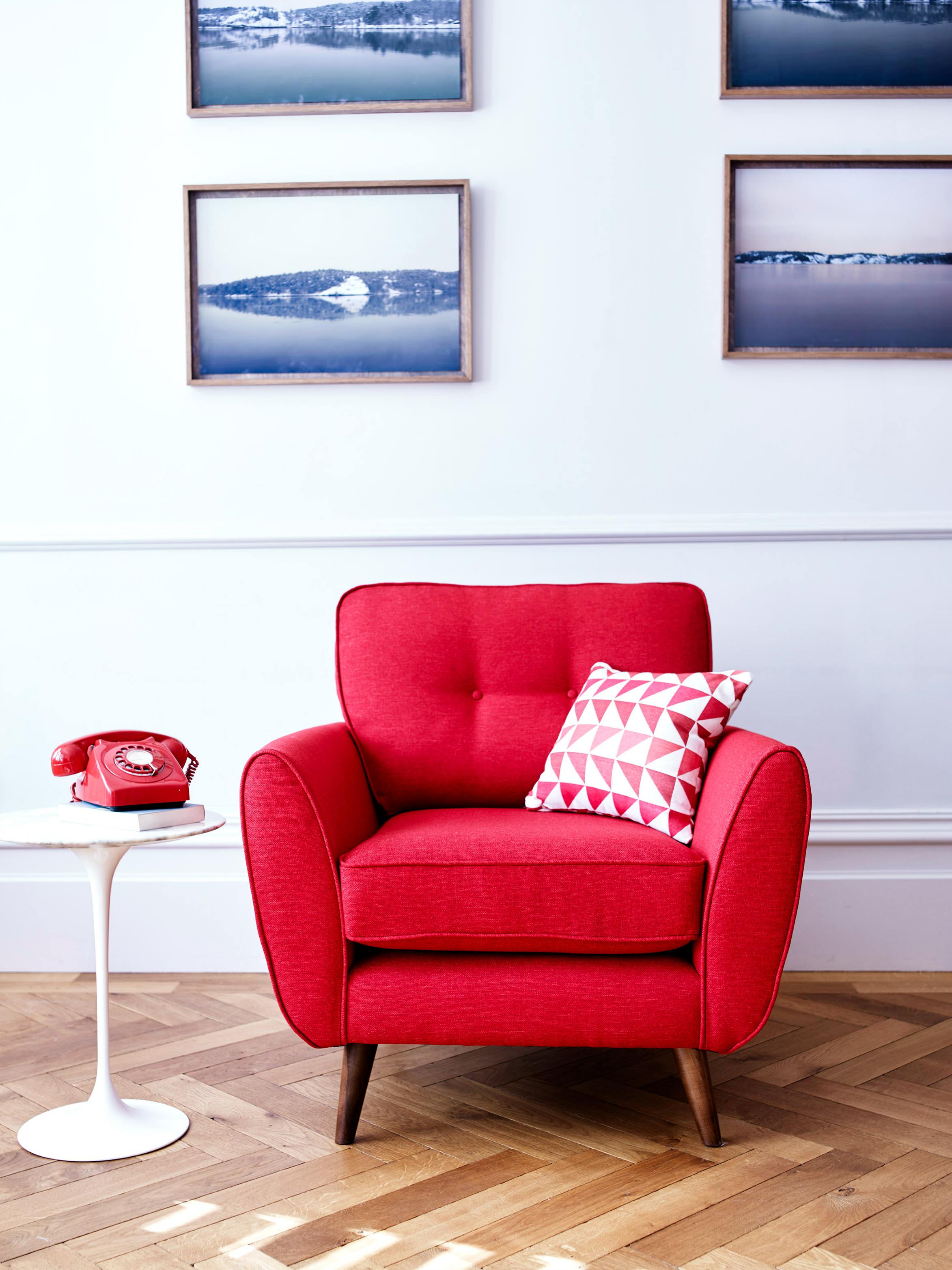 Now for Red. Fiery? excited? How do you feel looking at this?
Don’t you think those photographic prints look so peaceful and are cleverly juxtaposed against the bright red as a contrast?
Love the way the arm rest of this Zinc chair splays out to give more room when seated, and how the wooden feet mirrors it.
 Here’s the larger seated version. Someone is enjoying it.
When I see this, I often wonder what cats daydream about.
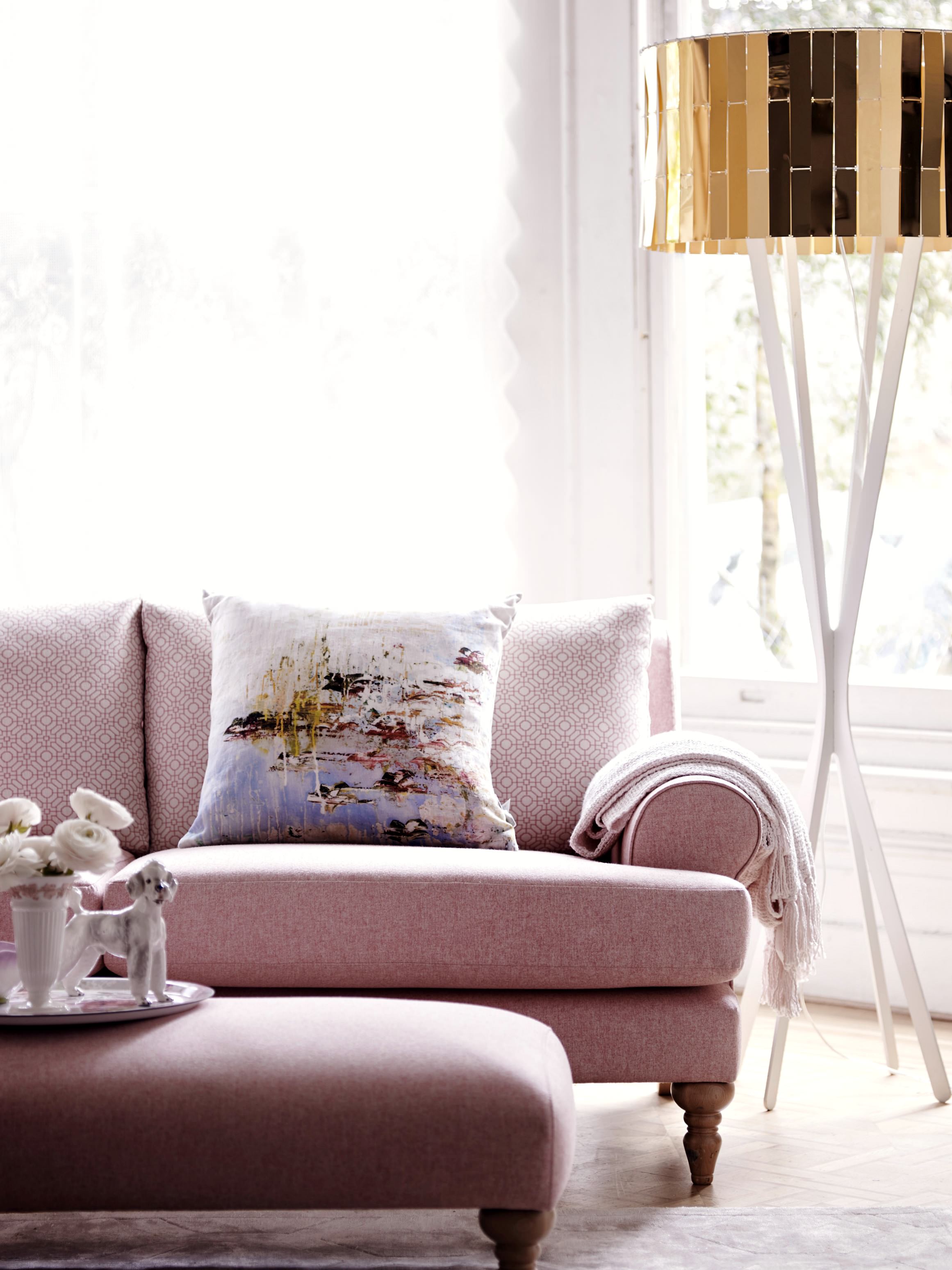 Pink is one of my favourite hues, but gold with pink is even better! What a great pairing between the sofa and that gold lamp.
This is the Itsy sofa and it comes with a delicate patterned back and sides.
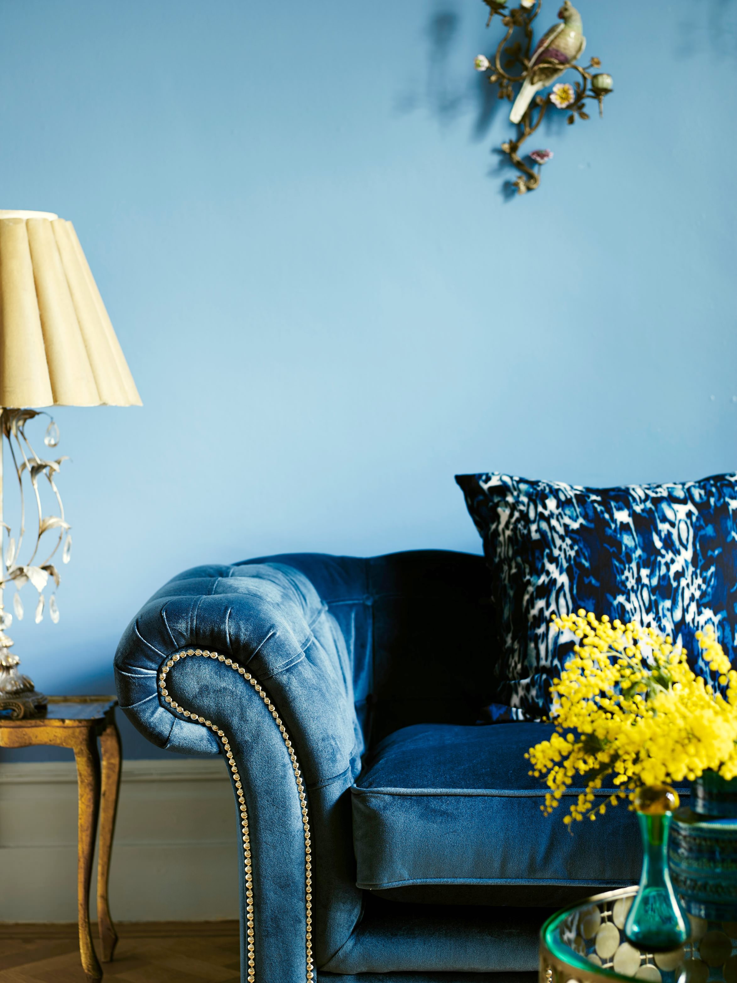 Now for some rich velvet blue with tones of Teal, lit up by the sunshine yellow of that fragrant Mimosa.
Step down two shades from the Teal to a powder blue.
Added touches of mint, greys and varying textures. How do you feel looking at this? I must admit, I’m liking that hint of orange in the cushion to break up the monotony of blues.
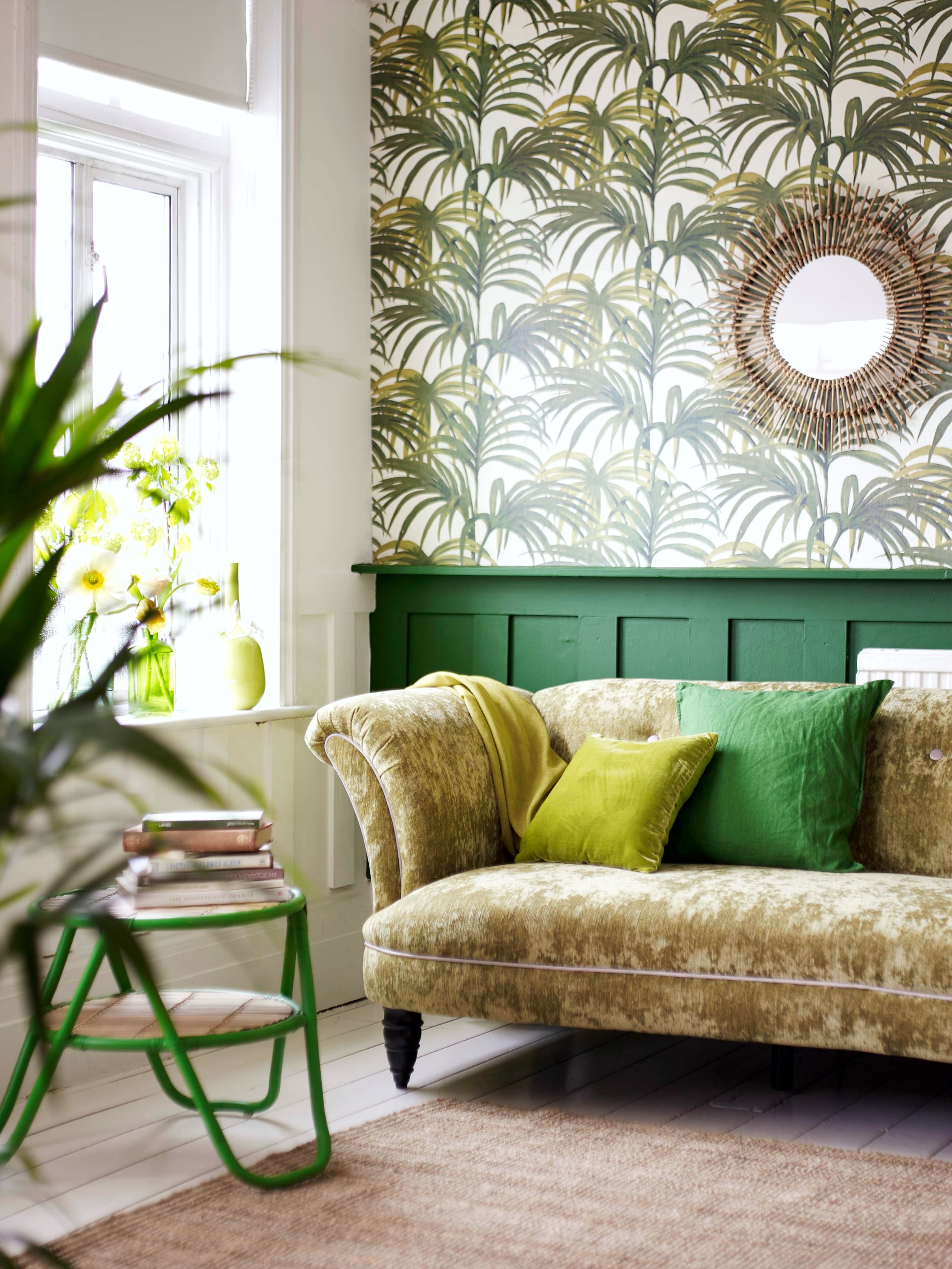 Shades of green is so fresh. This is the Concerto sofa.
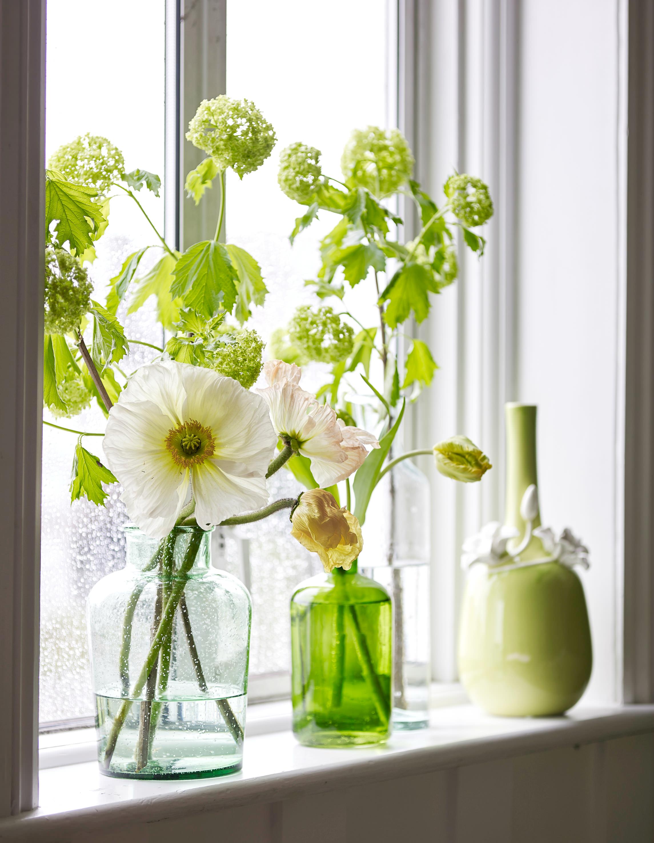
Green is certainly making a come back, if not in furniture, then in the botanicals in interiors trend of the moment.
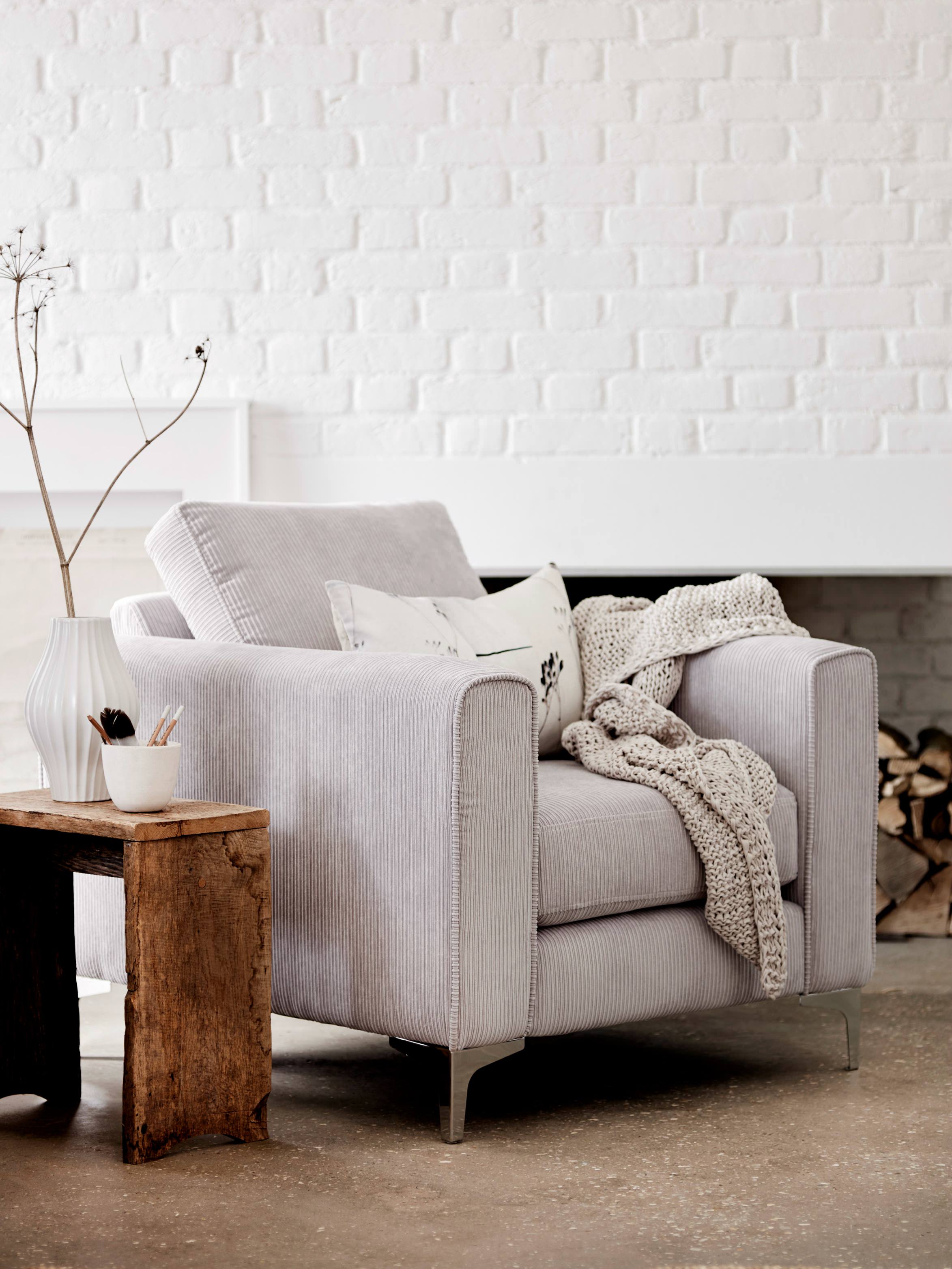 As you know, I love colour, but I would never turn away or shun a neutral shade.
What I love to do is to add some accent colour.
Perhaps a pale primrose yellow cushion would look good here?
This is the Stanza chair, perfect for a Scandinavian vibe to the room. The clean cut silver legs gives it that contemporary edge.
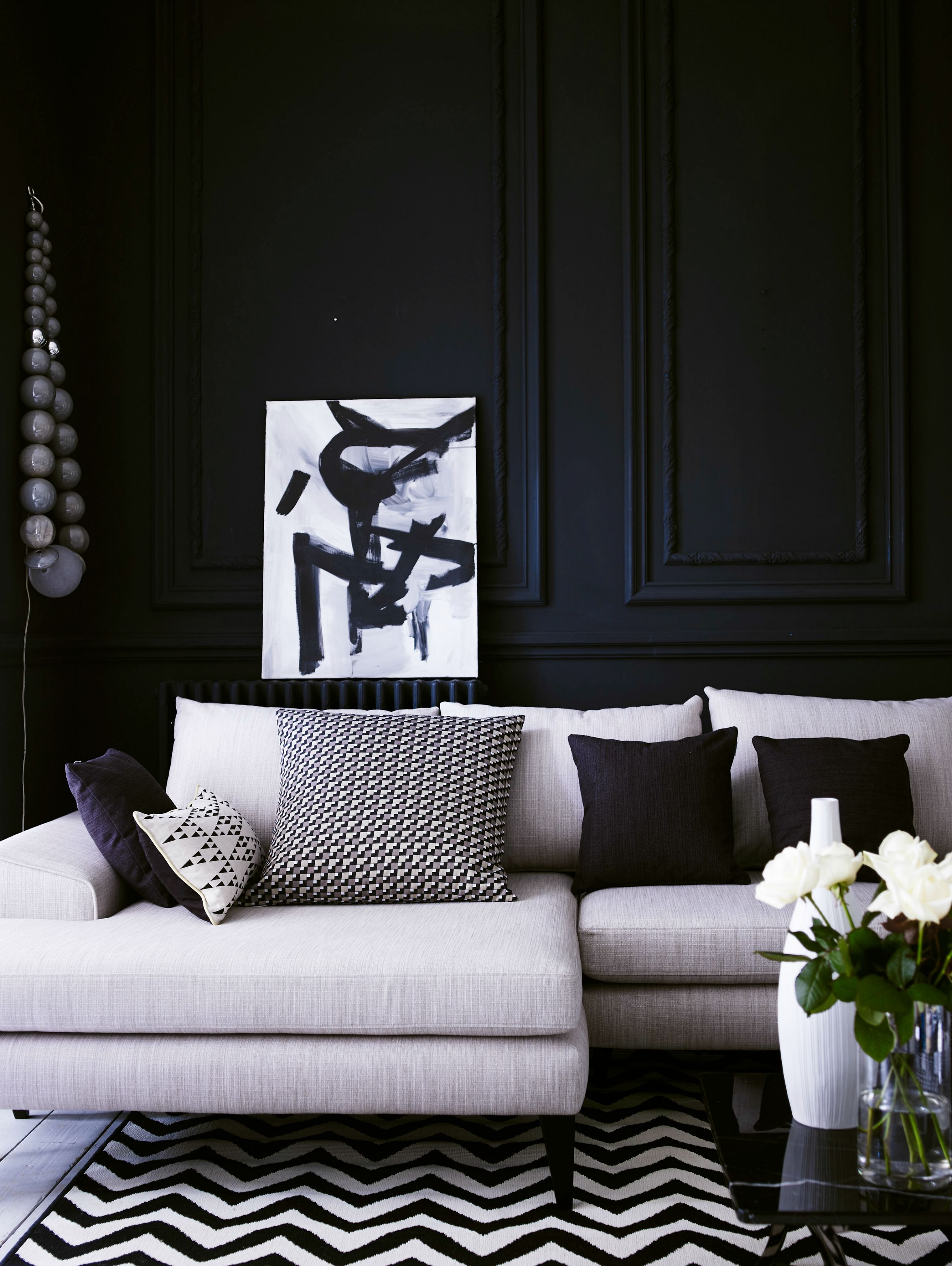 Monochromic black and white.
I must admit, I have once tried to style a room in my house in just monochrome, but predictably colour soon crept in.
Hats off to those who are able to be so disciplined, in sticking to the palette.
That aside, I am coveting this elegant L-shaped Quartz sofa.
 So, which one was your favourite and how did you feel about the individually coloured sofas?
See if your choice matched the Colour match research that DFS recently conducted with Mindlab, an independent research consultancy that applies psychology and neuroscience to help understand what people think.
The study was conducted in 1000 people, with a small proportion participating in a lab based EEG, where brain’s electrical activities were measured.
The long and short of it was that blue, teal and greys were the top colours people chose, as they were found to be mood enhancing.
Blue was energising, while grey made people feel comfortable and on-trend teal was perceived as relaxing.
Green was found to make people feel serene and apparently highly strung personalities were found to prefer this shade, as it made them feel more calm.
Red was found to make people feel agitated, while orange was associated with feelings of lethargy and tiredness. Perhaps it may be an idea to use the latter hues against calm neutral palettes, using them more as accent colours.
Hope you have enjoyed the post. Wishing you a fabulous week ahead.
( Post written in association with DFS as sponsored, images were provided by DFS).