I’m so happy to finally reveal my pastel colour bathroom, a mix of period and modern, created in part collaboration with Ripples bathroom.
It’s been a labour of love.
It’s been a journey and I’ve learned a lot about doing up a bathroom, from grout colours, to paint matching, tile shapes, trims and more.
However, that’ll be another blog post on its own.
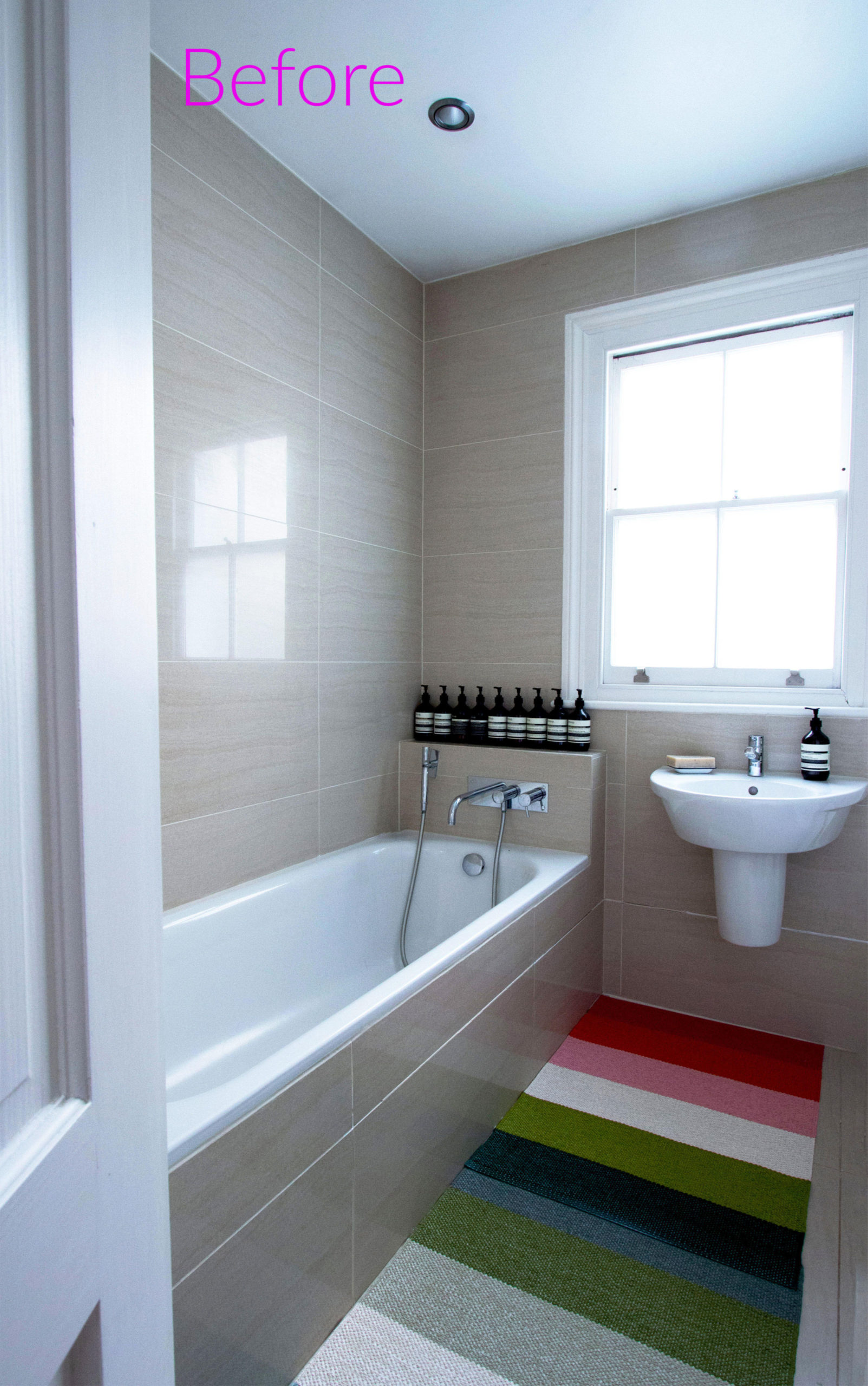
The image above is my original bathroom.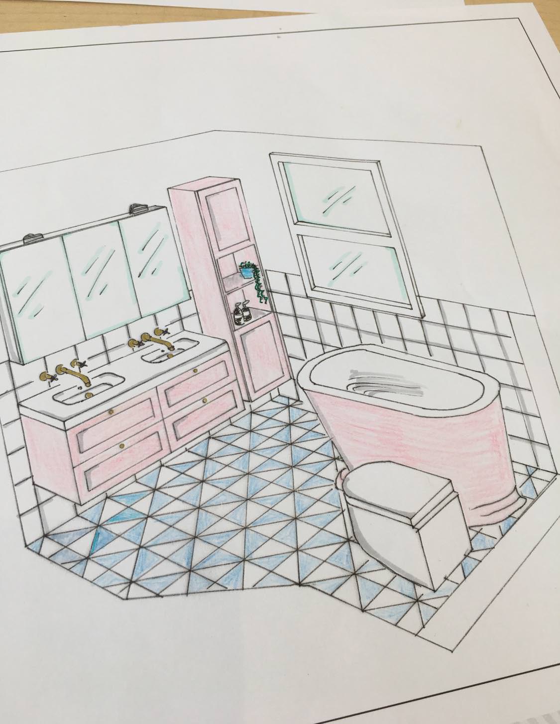 Ripples bathroom helped me with the initial design plans and supplied some of the bathroom furniture and fixtures.
Here’s a little sketch of the envisaged new bathroom co-designed with one of Ripples bathroom designers.
You will see that I have changed this bathroom design slightly from the initial drawing as the refurbishment progressed. 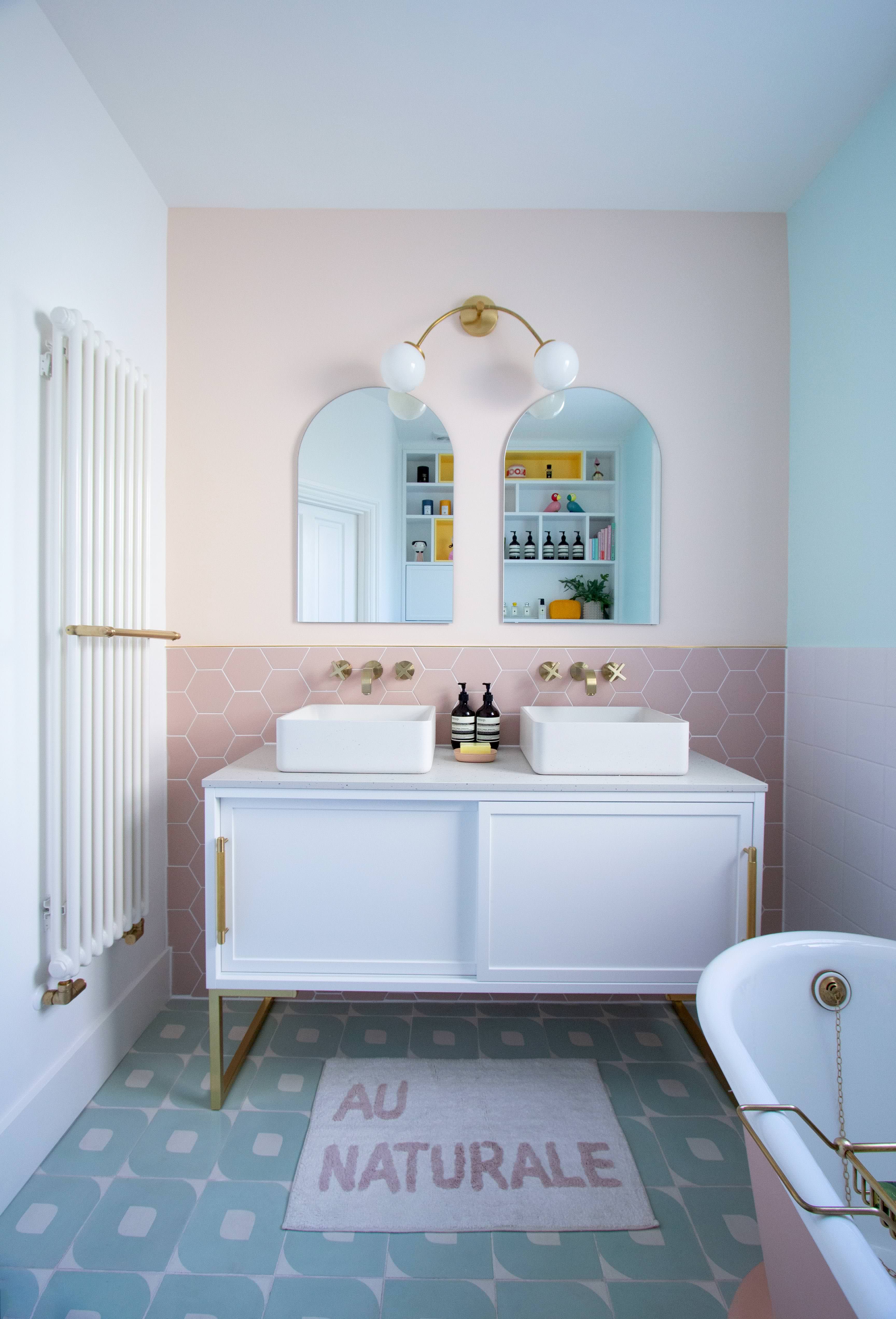 Here’s the bathroom. Let’s take a tour.
The gorgeous eye tiles in duck egg blue for the floor are by Ca Pietra. I fell instantly in love with them at first sight, and they formed the base palette for my bathroom colour decisions.
You can read more about the eye tiles here.
The initial design suggested that the bathroom should have an all white tiled wall ( see drawing above).
However, I wanted more warmth, so decided on a colourful feature wall over the vanity unit.
I selected these gorgeous hexagonal tiles called Hayek hex blush from Claybrook studio.
I’ve used a brass trim to separate the tiles and painted wall.
It was not easy finding the right shade of pink. I finally went for a peachy pink tone.
 The white tiles encasing the other walls are called Minton hollis from Topps tiles.
Strange as it may seem, I found it difficult finding the perfect white tiles.
The issues I encountered was finding white tiles of the right size, with the perfect straight edge, and one with a uniform white tone on its surface.
I’ve decided to keep these parts of the bathroom wall white, to give the room a sense of space, without competing with the other colours.
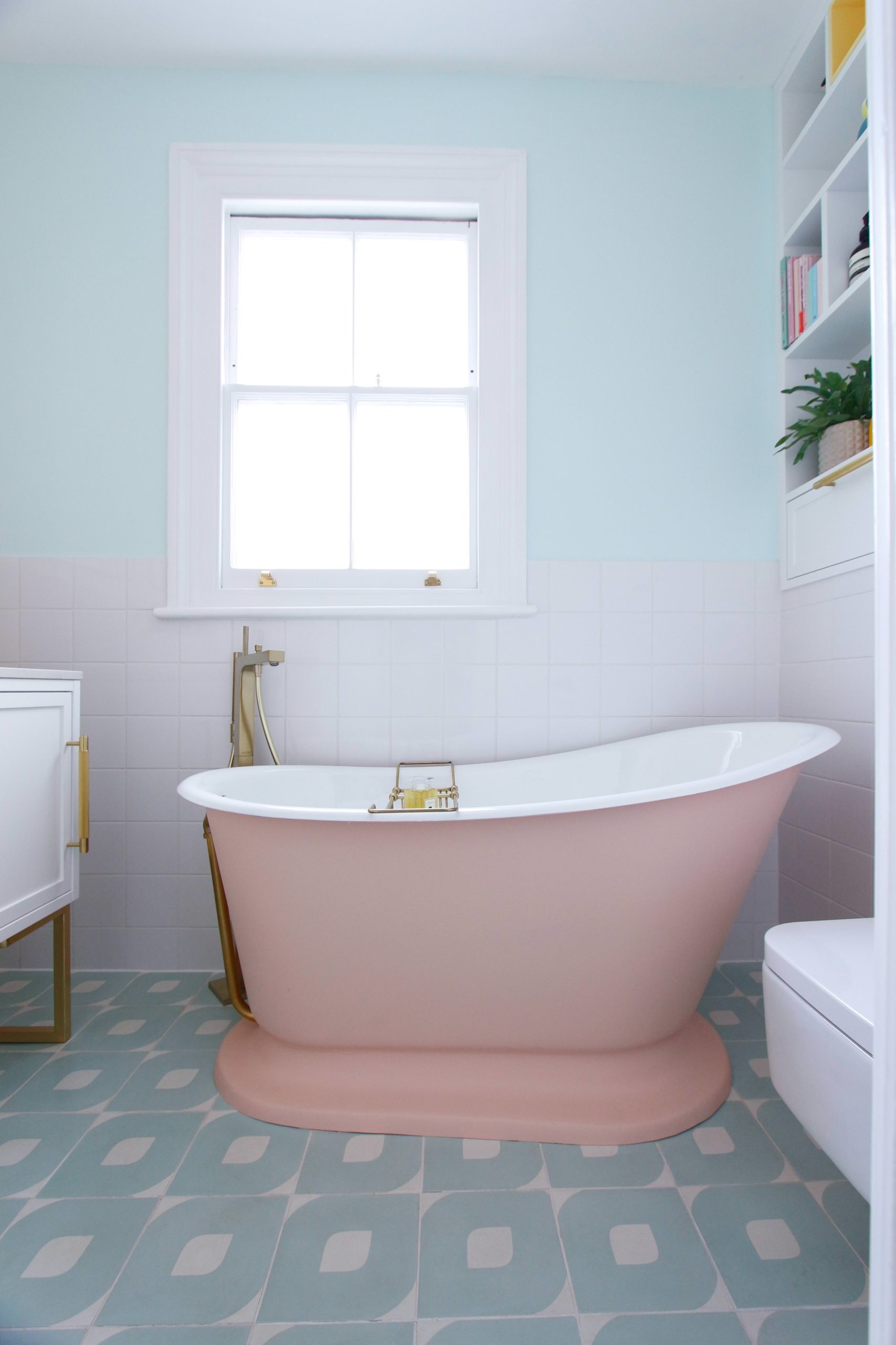
It was also the perfect backdrop for the peach roll top bath.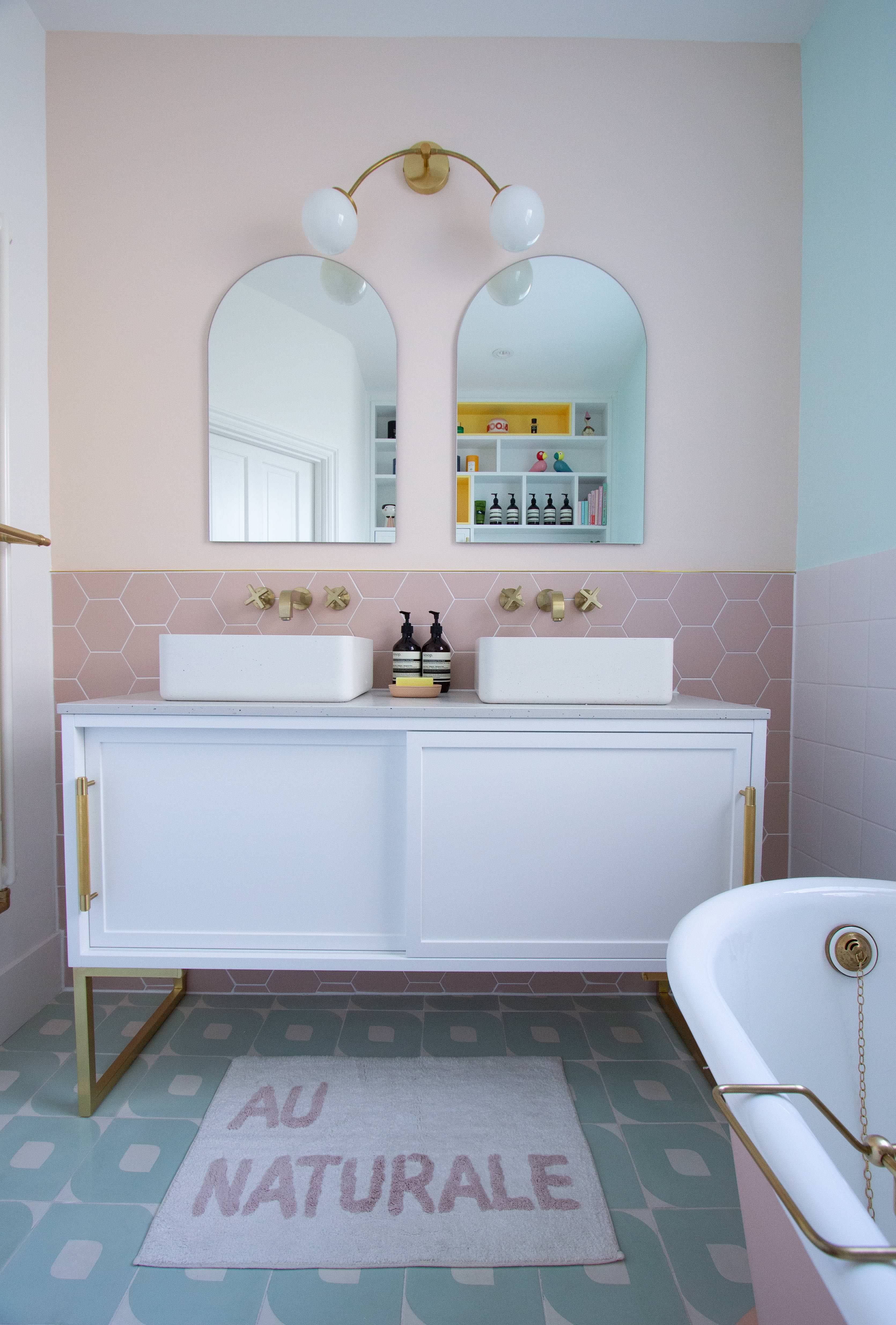 I’ve always wanted brush brass in my bathroom, so the finishing touch was easy to decide.
Ripples introduced me to the Hansgrohe brand.
The form, feel and function of Hansgrohe’s brassware really evoke luxury and quality.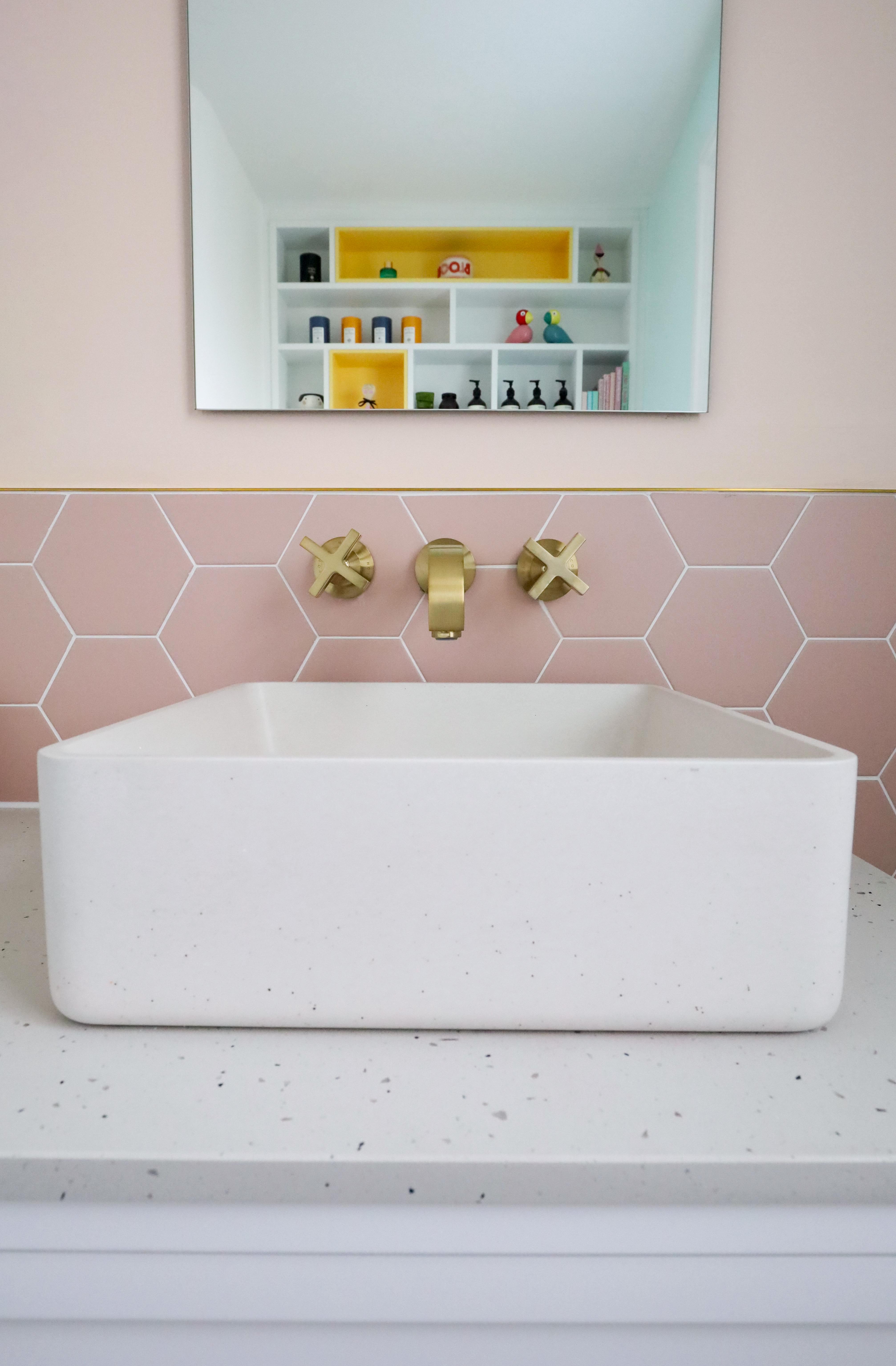 I paid a visit to Hansgrohe’s showroom in London and selected the Axor Citterio 3 hole basin mixers with crossed handles.
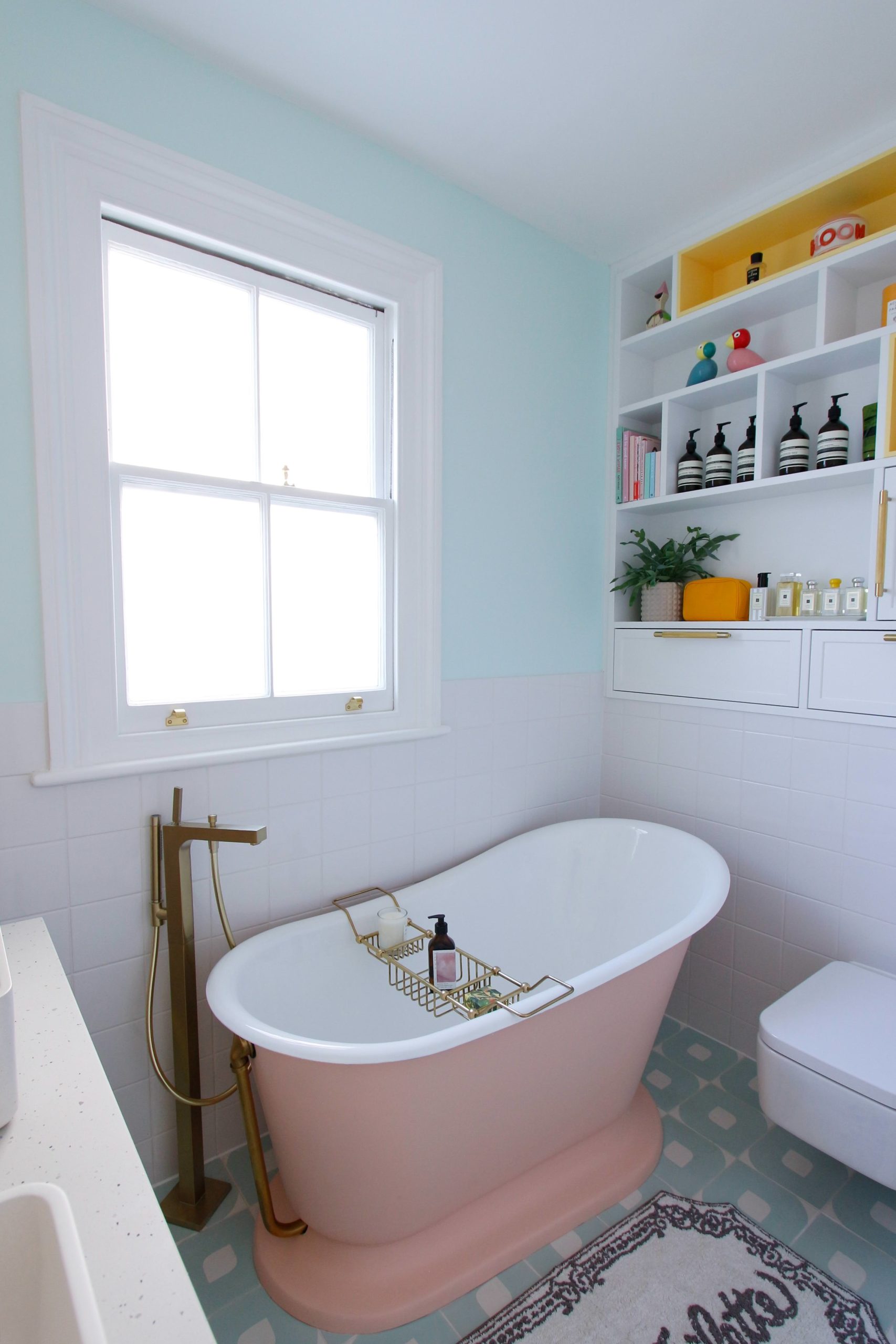 I also selected the Axor Citterio floor standing bath shower mixer which you can clearly see in this image. Hansgrohe kindly bespoke plated them in brush brass for me.So what do you think of the bathroom?
I wanted this pastel colour bathroom to feel light, happy, and aesthetically me.
I also wanted it to fit seamlessly with the decor in the rest of my house, a mix of modern and period Victorian.
You can definitely see those 2 elements in my bathroom.
The Bisque Classic radiator, original sash windows, roll top bath and Hansgrohe cross taps gives the space that period feel, whilst the colourful tiles, painted walls and bespoke vanity and shelving units adds a modern touch.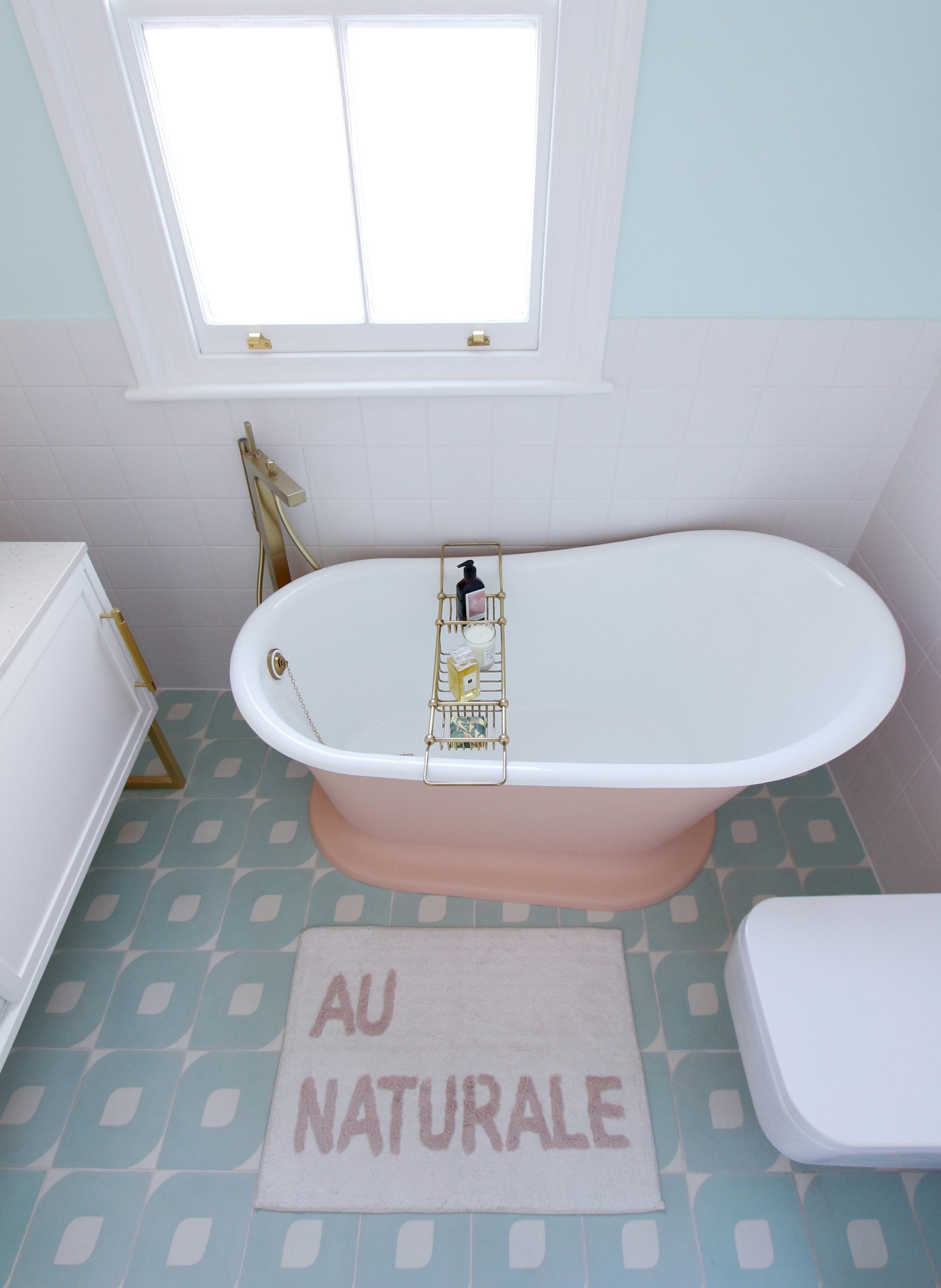 A freestanding roll top bath had always been on my wish list, so this was the perfect opportunity to get one.
This Hurlingham slipper bath has a lovely inner contour that supports my back well. It’s also deep, which means I can immerse myself properly in warm water, much like the traditional Japanese baths that I like.
Ripples kindly sourced a smaller roll top bath from Hurlingham for me.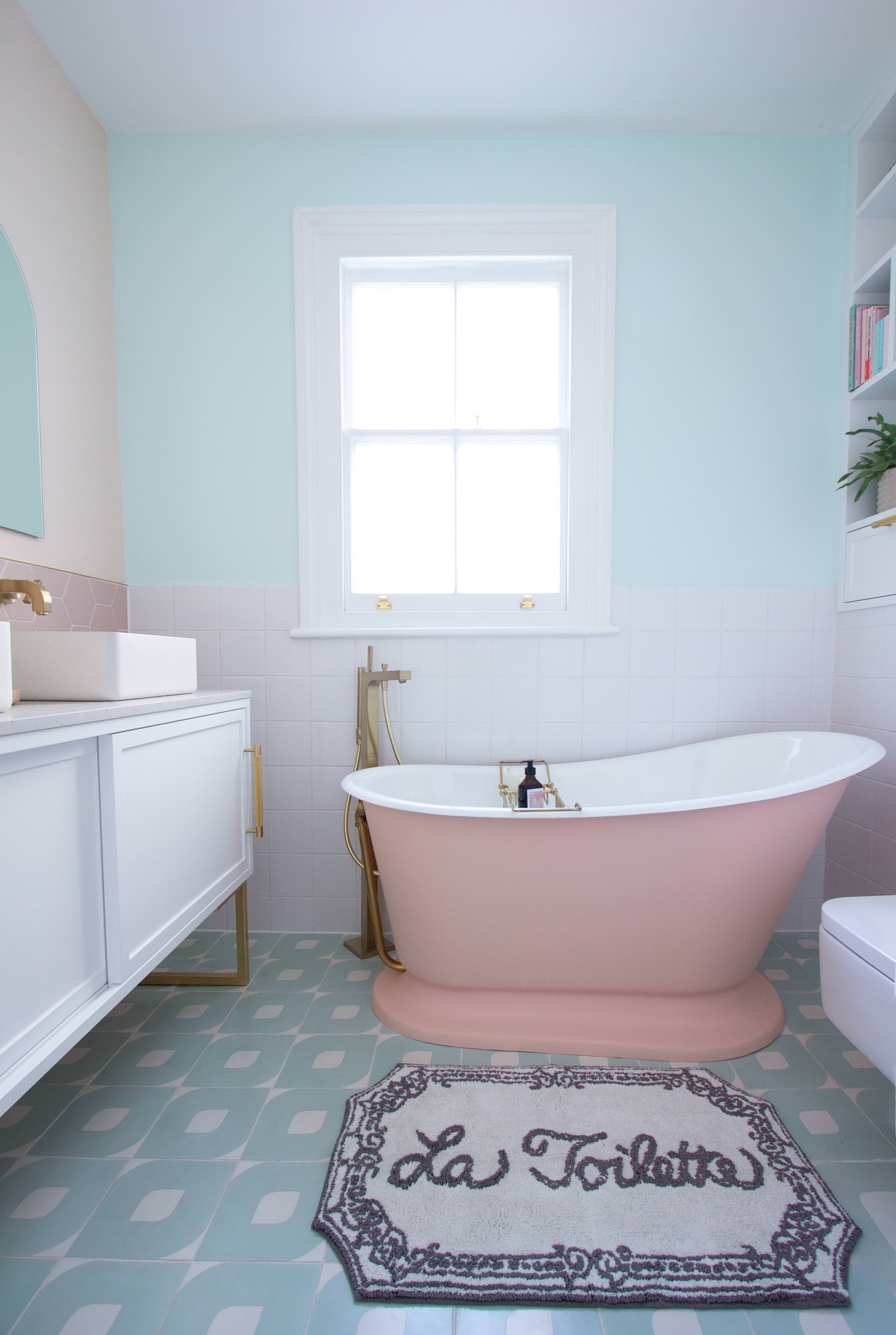 The roll top Bath has been spray painted with a peach tone paint called Antique coral from Benjamin Moore.
Talking about paint colours, I decided to use 2 colours on my bathroom wall to match both the floor tiles and the roll top bath. I used Irish mint aura and Orange sorbet from Benjamin Moore.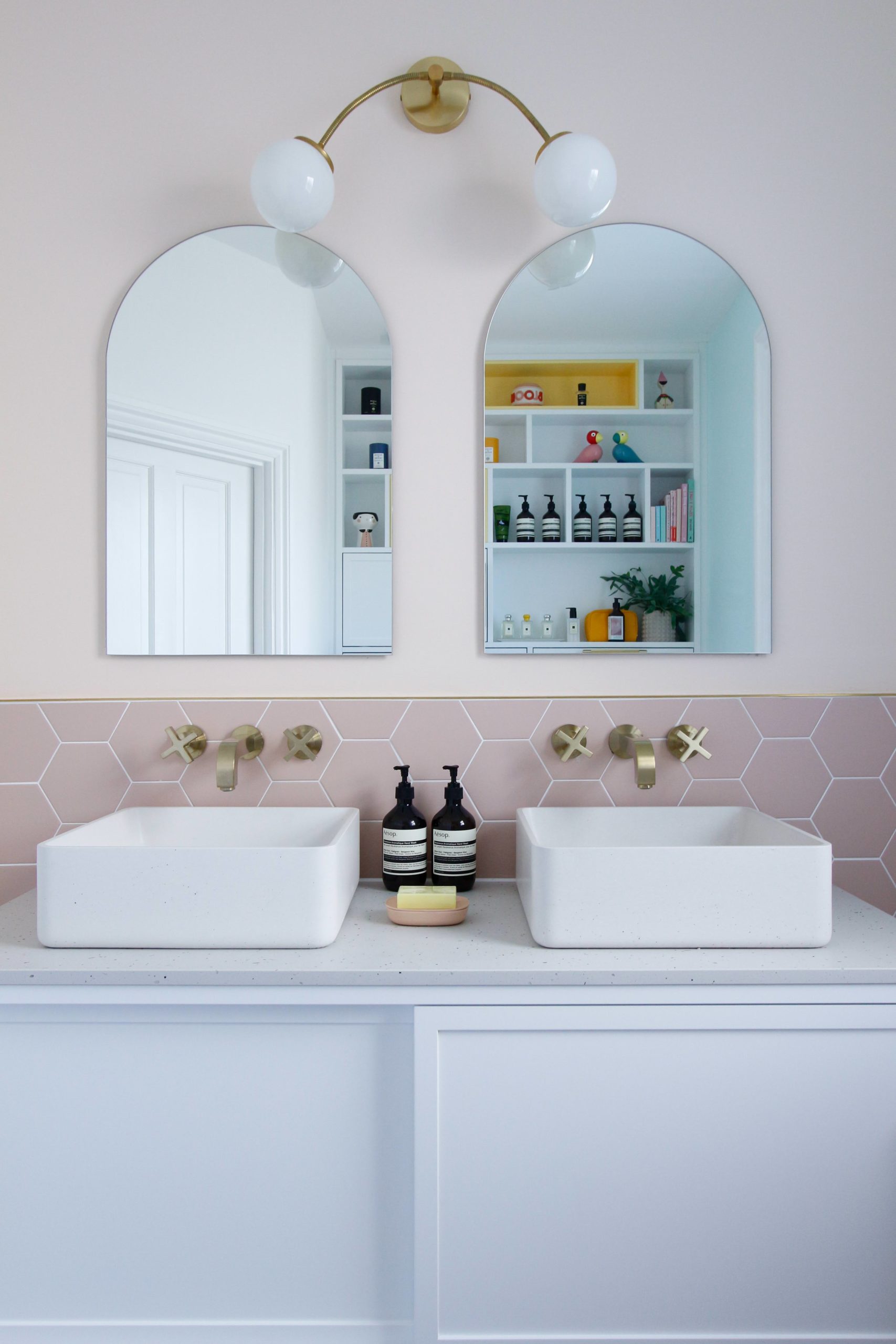 I’ve always wanted double basins in my pastel colour bathroom, and am so pleased with these 2 concrete arla basins from Kast concrete, supplied by Ripples.
I’ve had my eye on these basin for quite a while. I love how elegant they look, the natural smooth texture of concrete adds warmth to the white vanity unit.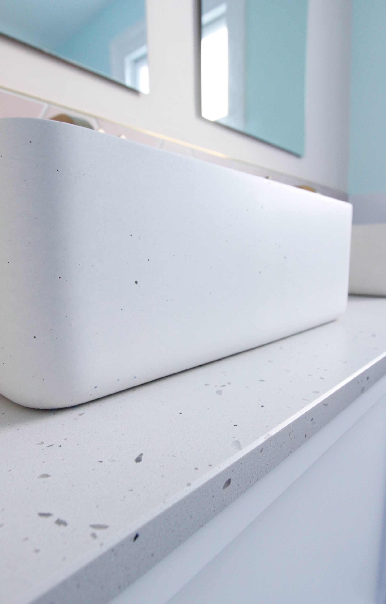 To compliment the concrete basins, I’ve selected this “>Caesarstone Frozen Terra quartz worktop to go on top of the vanity unit.” href=”https://littlebigbell.com/wp-content/uploads/2020/02/frozen-terra-quartz-scaled.jpg”>
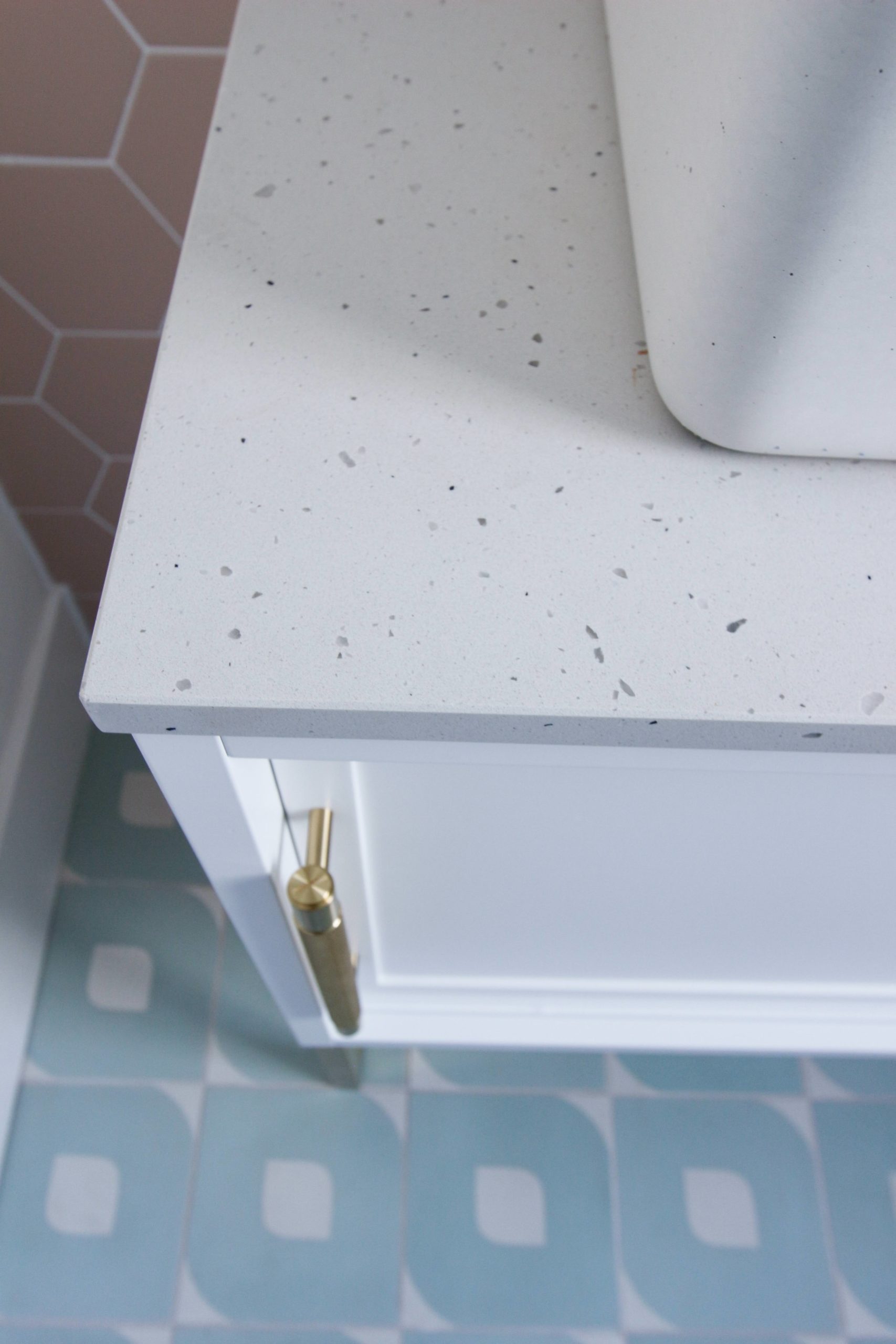 Here’s another view. You can read more about Caesarstone’s quartz worktops here.” href=”https://littlebigbell.com/wp-content/uploads/2020/02/bathroom-side-view-scaled.jpg”>
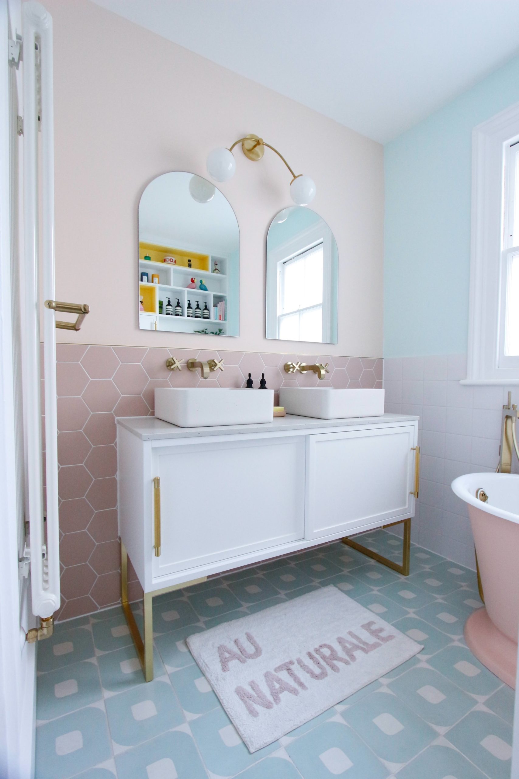 The vanity unit was initially attached to the wall and suspended above the floor to create a sense of space.
The unit itself, made of wood, was quite heavy.
I became a bit nervous that the weight of the unit, heavy quartz worktop and 2 concrete basins would put strain on the walls.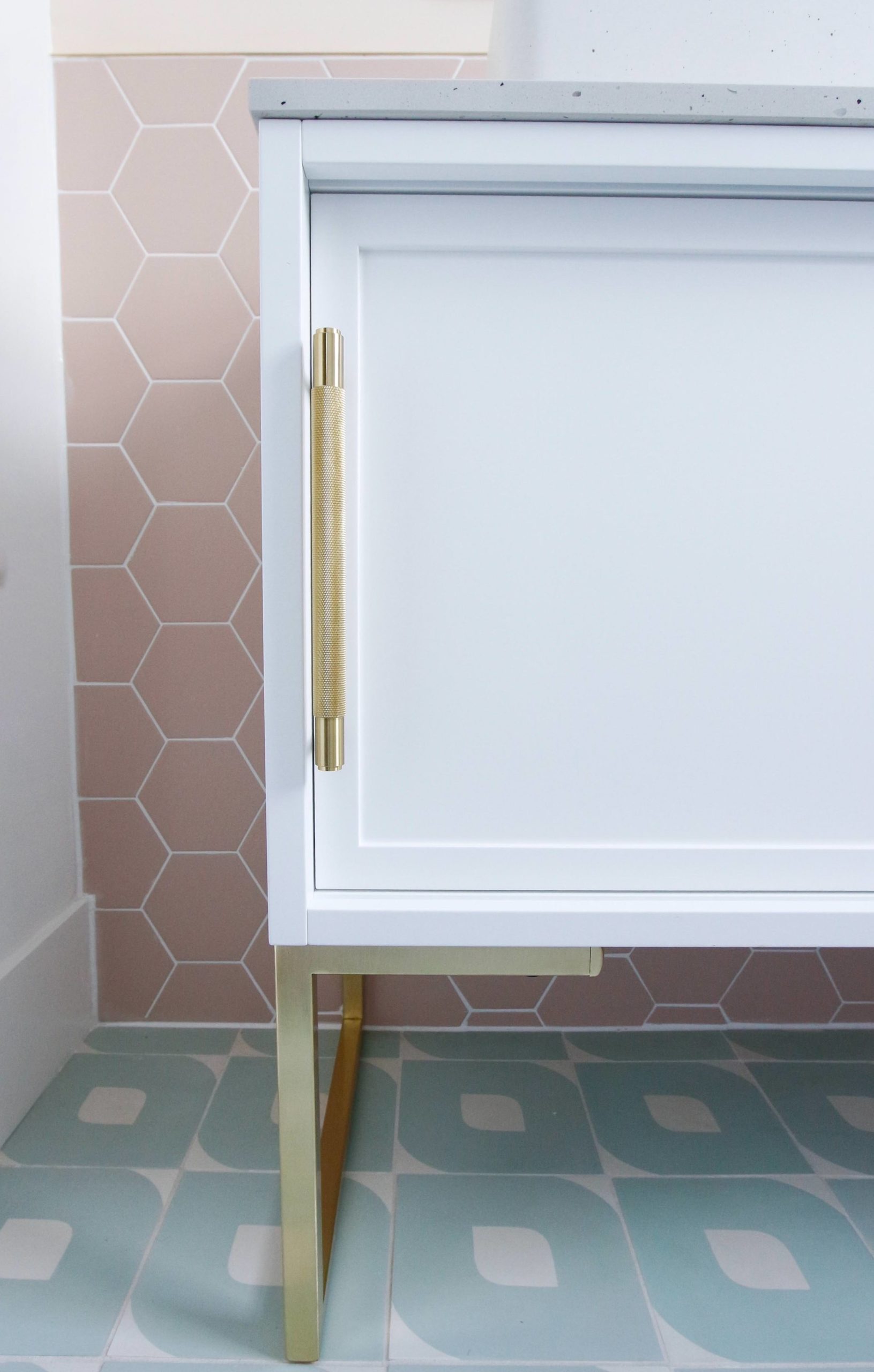 To give me peace of mind, I decided to add some custom made brushed brass legs from Urban Editions.
It was probably the best decision ever, as those brushed brass legs have really pulled all the brass elements in the bathroom together and given the unit a finished look.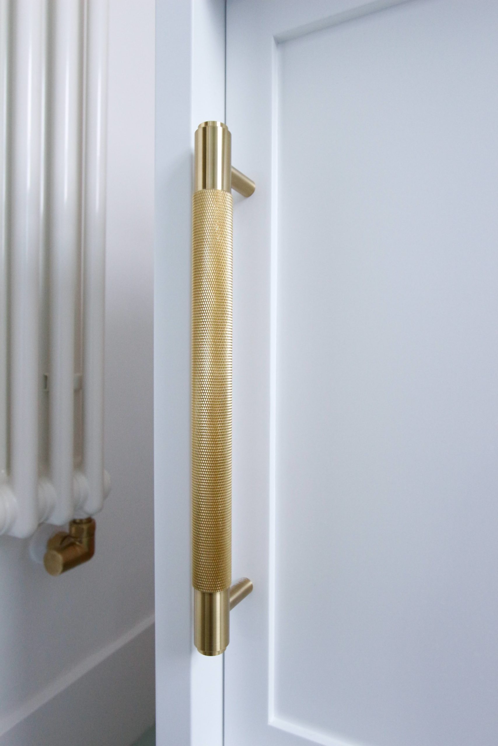 The brass pull bar handle for the vanity unit is from Buster and Punch.
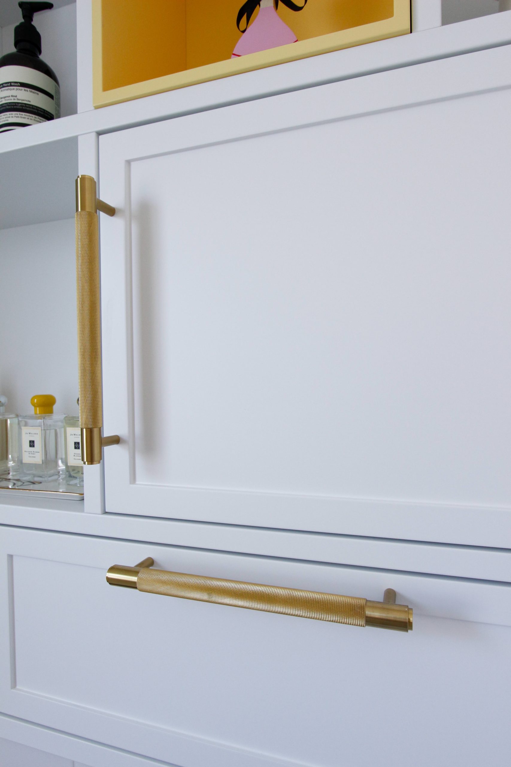 The bespoke shelving units on the opposite end of my bathroom also have matching Buster and Punch handles.
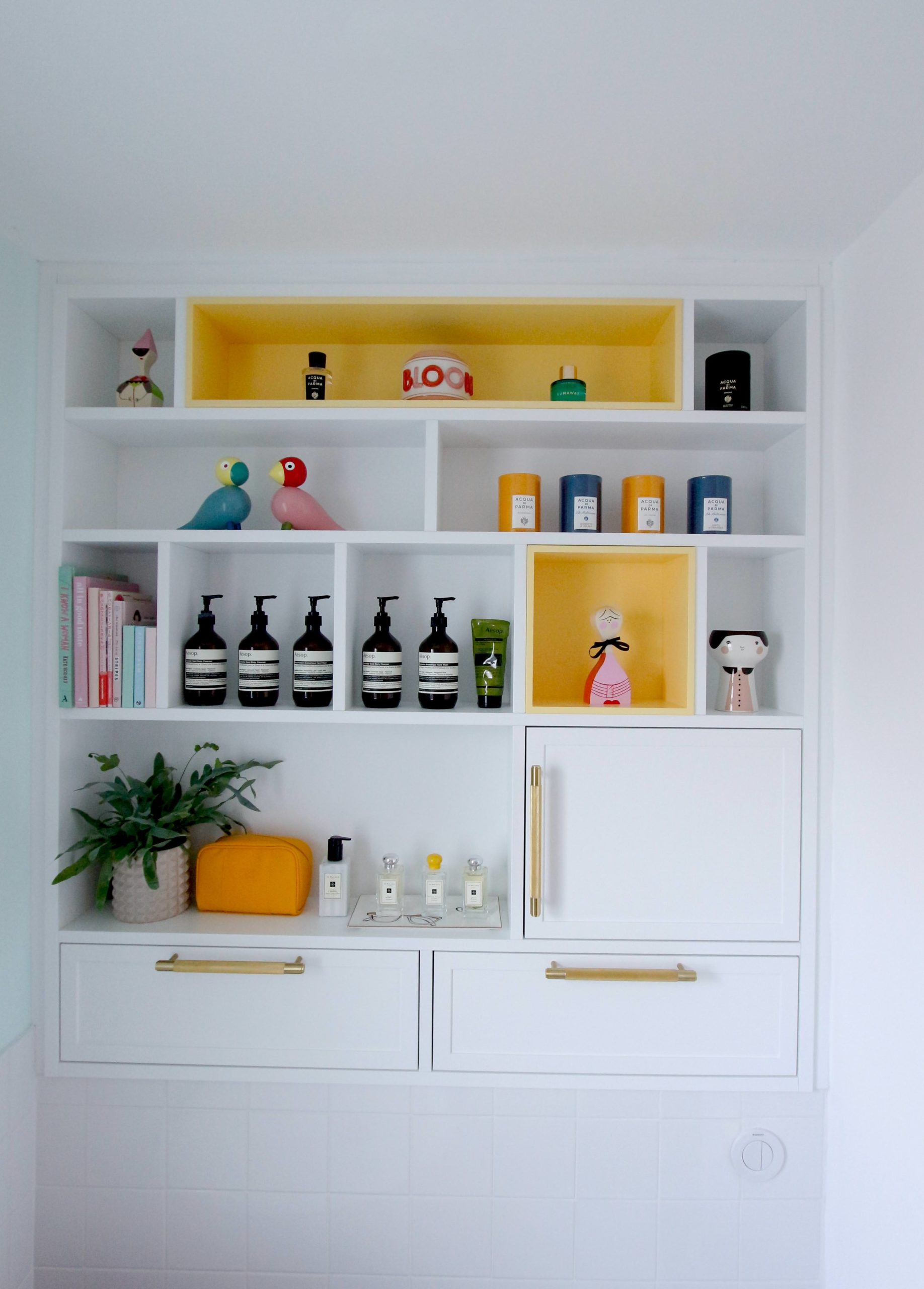 Here is the shelving unit with removable yellow shelves.
I co-designed the vanity unit and shelving units with mead architecture and design, made by en masse interiors.
Mead architecture did the building work for the bathroom too.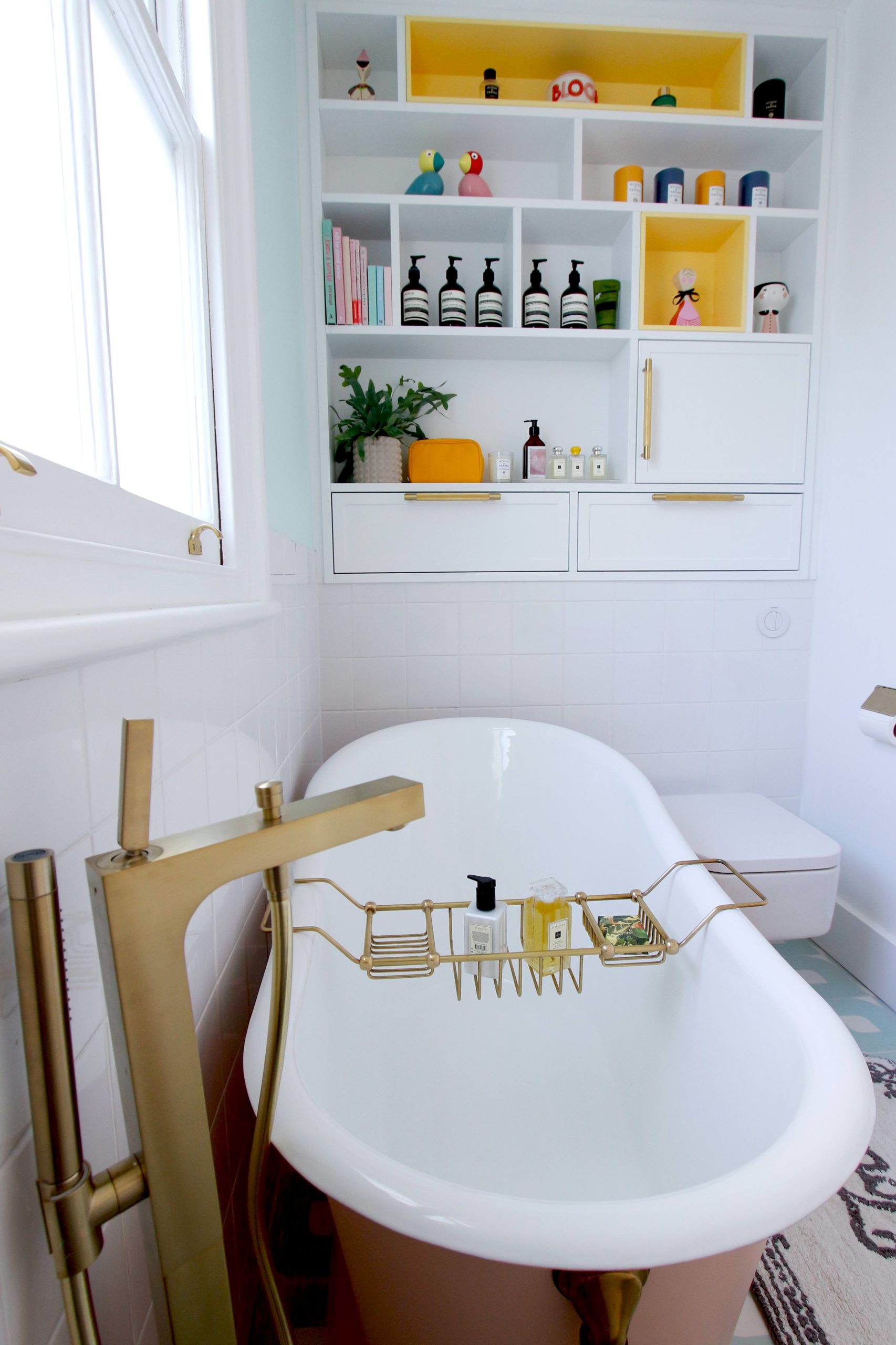 I didn’t have much storage in my last bathroom, and I also wanted somewhere to display my lovely toiletries.
  I love how I can see the displayed shelving unit whichever way I stand in the bathroom, as it is reflected off these gorgeous arch mirrors from H&M Home.
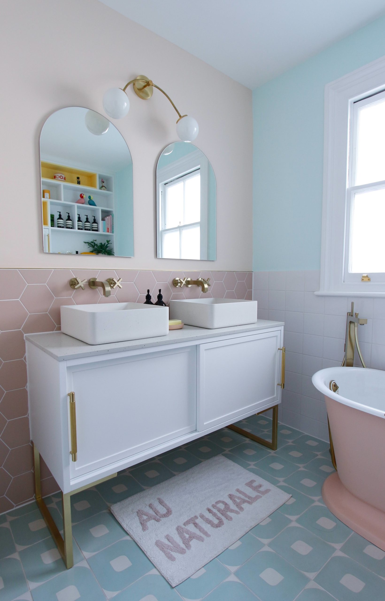 “>Last but not least, I can’t not mention these beautiful opal wall sconces, specially designed for me, to specification, by the talented Spark and Bell.
I wanted something that would be adjustable, with a soft glow for putting make up on.
I found a lot of the overhanging wall lights cast shadows on the face, making it difficult to visualise. The opal glass diffuses the light well.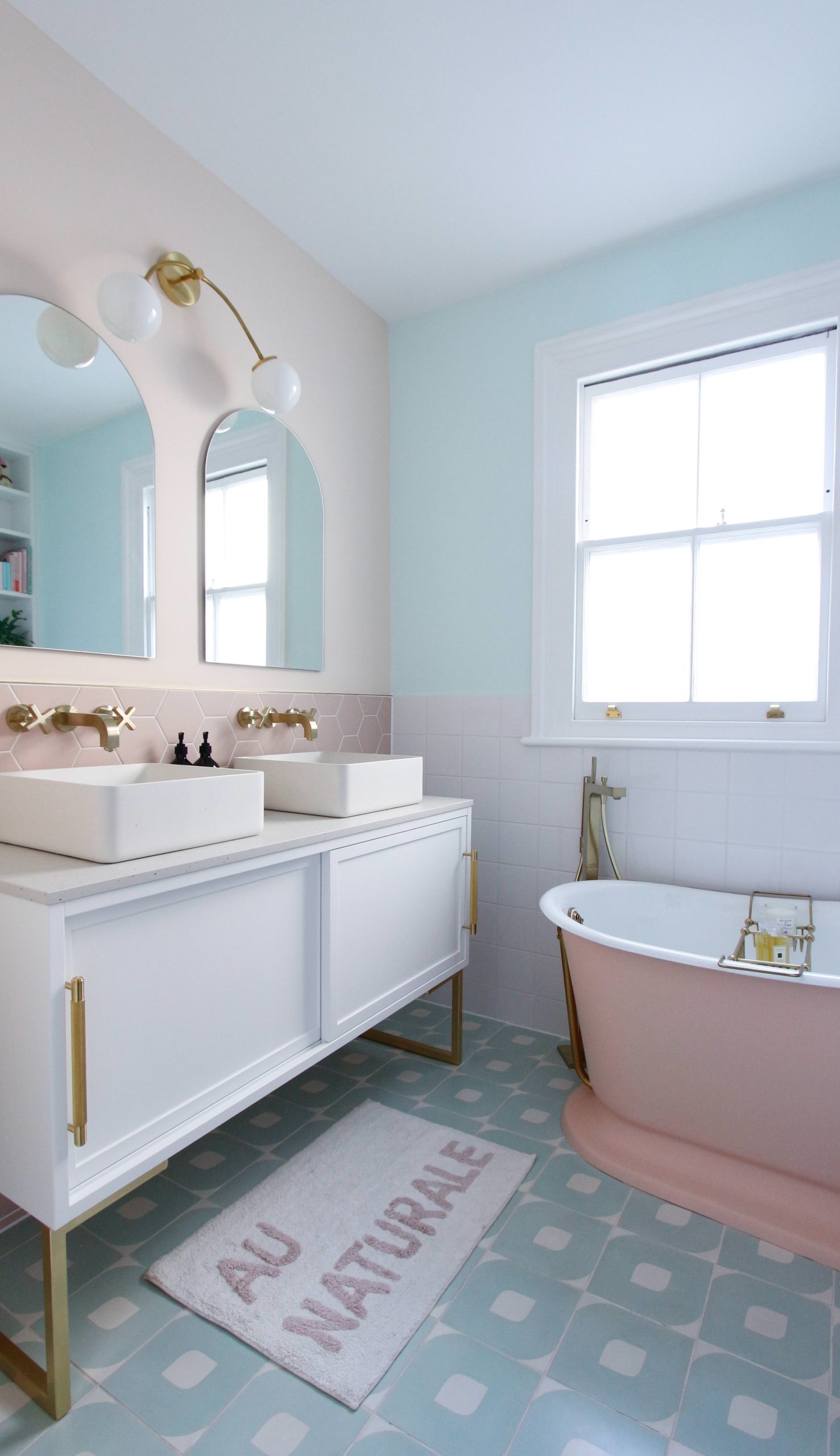 There are ceiling downlights in the bathroom to make it bright at night too, but if I want to relax with candlelight in the bath bath, I’d usually just turn the wall sconces on.
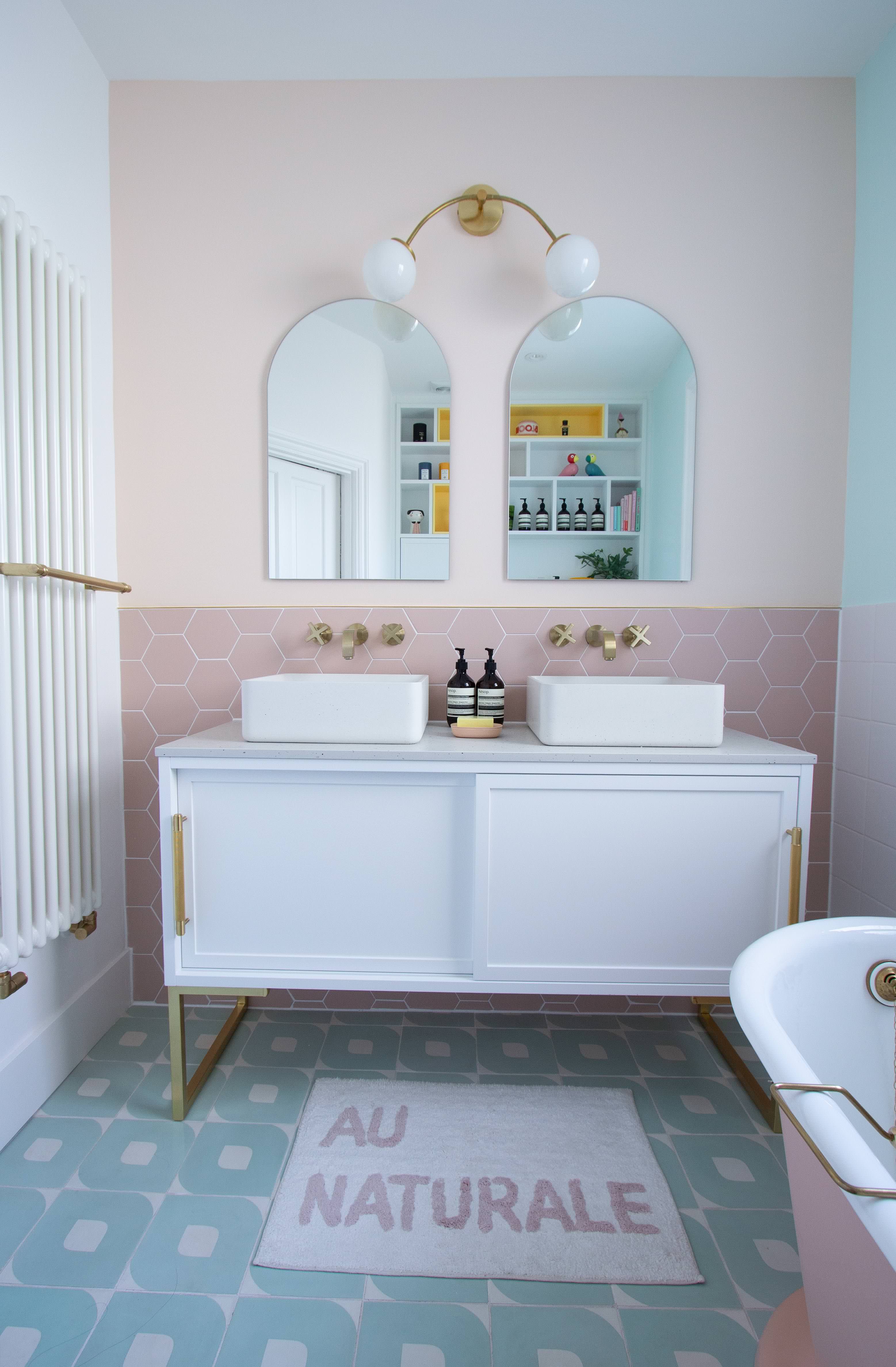 So there you go, my small customised pastel colour bathroom in happy colours. What do you think?
Finally, I’m grateful to Ripples for helping me with the initial design. They helped me source some of the bath furniture and fittings too.
(All photography of this pastel colour bathroom are the copyright of Geraldine Tan, editor of Little Big Bell. Any usage of photos from this site requires permission. The worktop, basins and taps are gifts. The bath tub, radiator were discounted via Ripples. )