 Farrow and Ball recently commissioned me to produce a mood board for them. I absolutely love their paints, so it was an instant yes.
My whole house is actually painted in Farrow and Ball. Although my home is colourful, the backdrop is neutral.
My walls are Farrow and Ball Strong White, the skirting boards and cornices are in All White. My stairs and fireplaces are painted in Cornforth White.
That is going to change soon, as I will be introducing more colour to the walls.
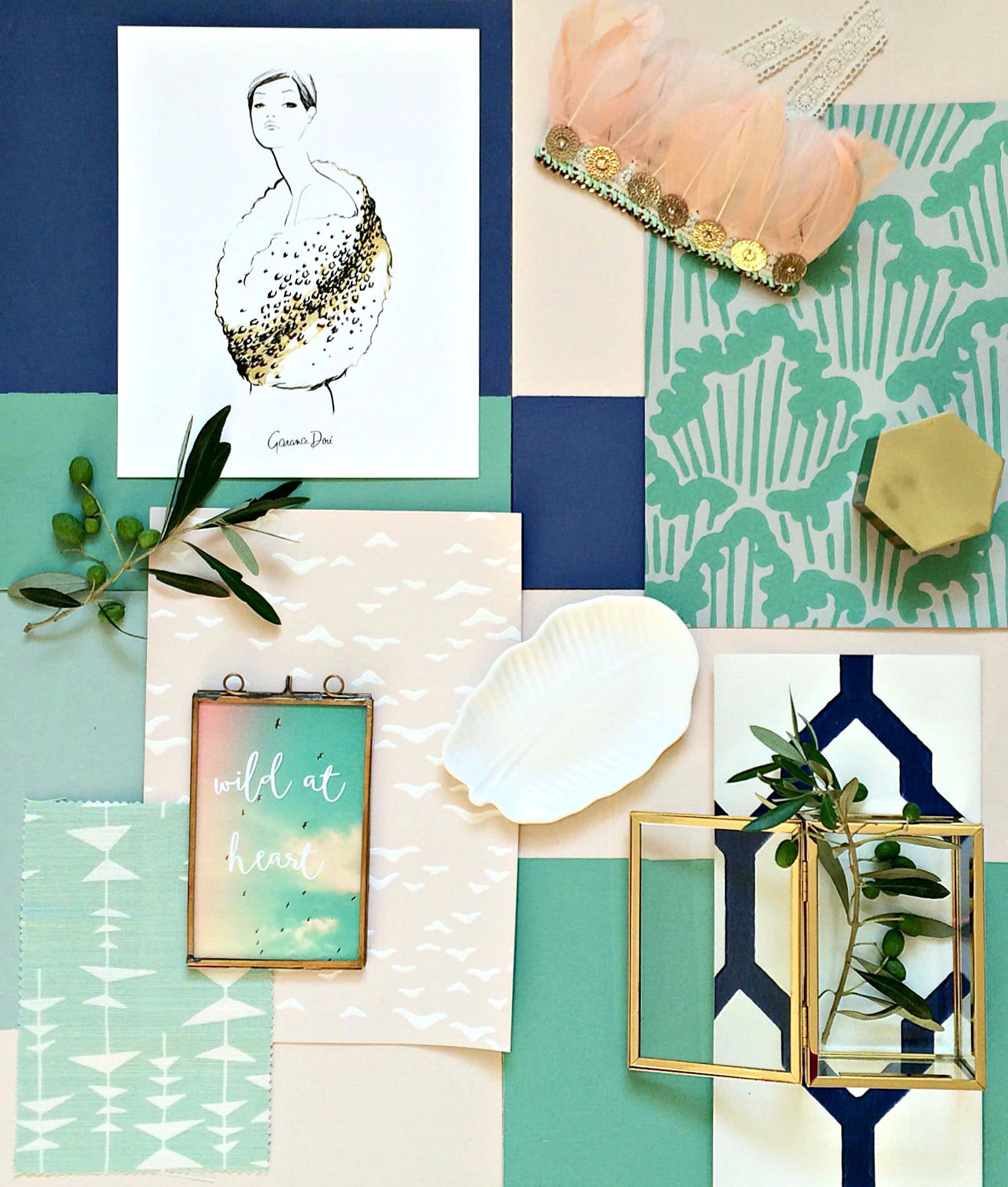
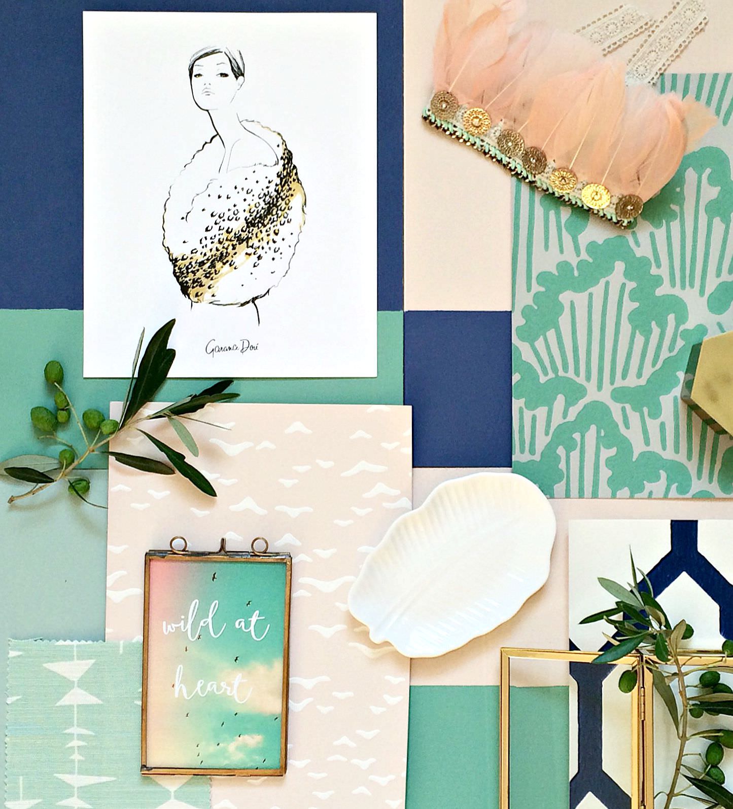
So, here are the colours that I have chosen: Pitch Blue, Arsenic, Green Blue and Pink Ground. The main accent feature against all these colours is gold. ( All on mood board above).
I think blues and pastels are going to be a growing trend this season and next.
Girly glamour and gold is going to feature a lot too.
The indoor green movement with houseplants is still going strong, the shade of green is gradually being translated into rooms, as accent colours.
For Summer, I’ve been drawn to pale pink, fuchsia, mint, sky blue and canary yellow. They are actually my signature colours.
Now that Autumn is approaching, I have kept to a similar palette, but introduced warmer and cosier tones.

I’m loving Pitch blue for its darker Winter shade, but there remains a bright pigment which makes colours, pastels or bright, pop when set against it.
If you are worried about combining pastels with dark colours, then Pitch blue is the tone for you, because it works well with pale pink and mint.
If you look at the mood board that I created at the very top of the post, you can see that Pitch blue can combine well with the pale of Farrow and Ball colours such as Pink Ground and Green Blue.
The picture collage just above, gives you an idea of how well the mint and blue in the little girl’s outfit can combine. Also see how the blue rug goes so well with the pink chairs.
I have picked two greens, Arsenic and Green blue. The latter two colours are part of the same spectrum, just a different saturation. They combine well together. Have a look at the green chairs above showing how a green spectrum can combine.
Arsenic is such a vibrant green, great to use as an accent colour against Pitch blue. Take a look at the image of the living room in the photo above, with the green door frame and skirting. This is how Arsenic could work with Pitch Blue.
Summer for me is pinks in light candy sweet shades and bright fuchsias. Now that Autumn and Winter is approaching, I’m so pleased there is a calming and warm tone of pink being introduced. The chalky warmth of Pink Ground allows it to blend with the darker shades like Pitch blue and brighter greens such as Arsenic, without a clashing effect.
( Image for collage sources left to right, from top 1 |1a | | 2 | 3 | 4 | 5 | 6 .)
 Here, I have placed some bright blues against the calm of Pink Ground,
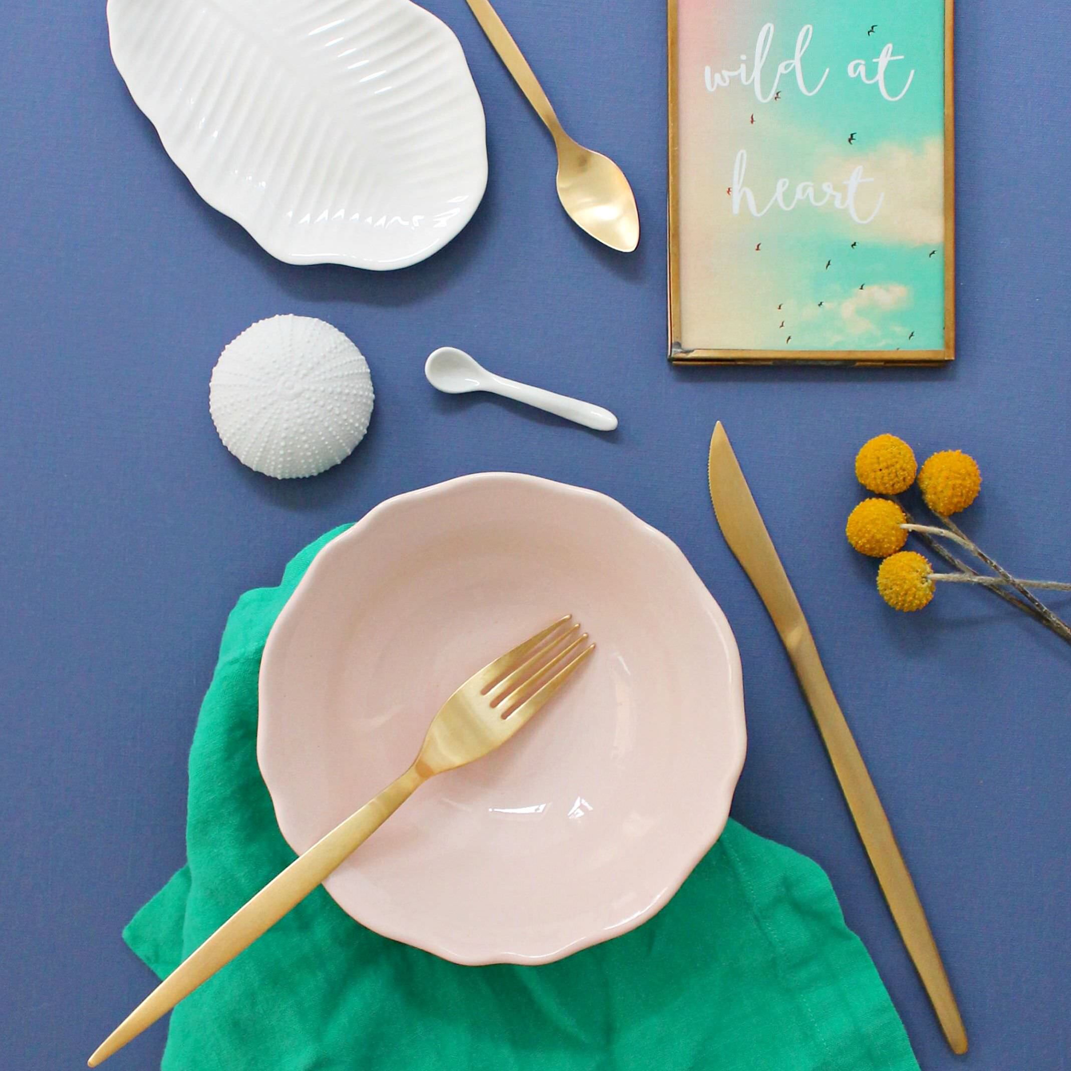 and look how happy the greens, pastel pink, gold and yellows look, when set against Pitch Blue.
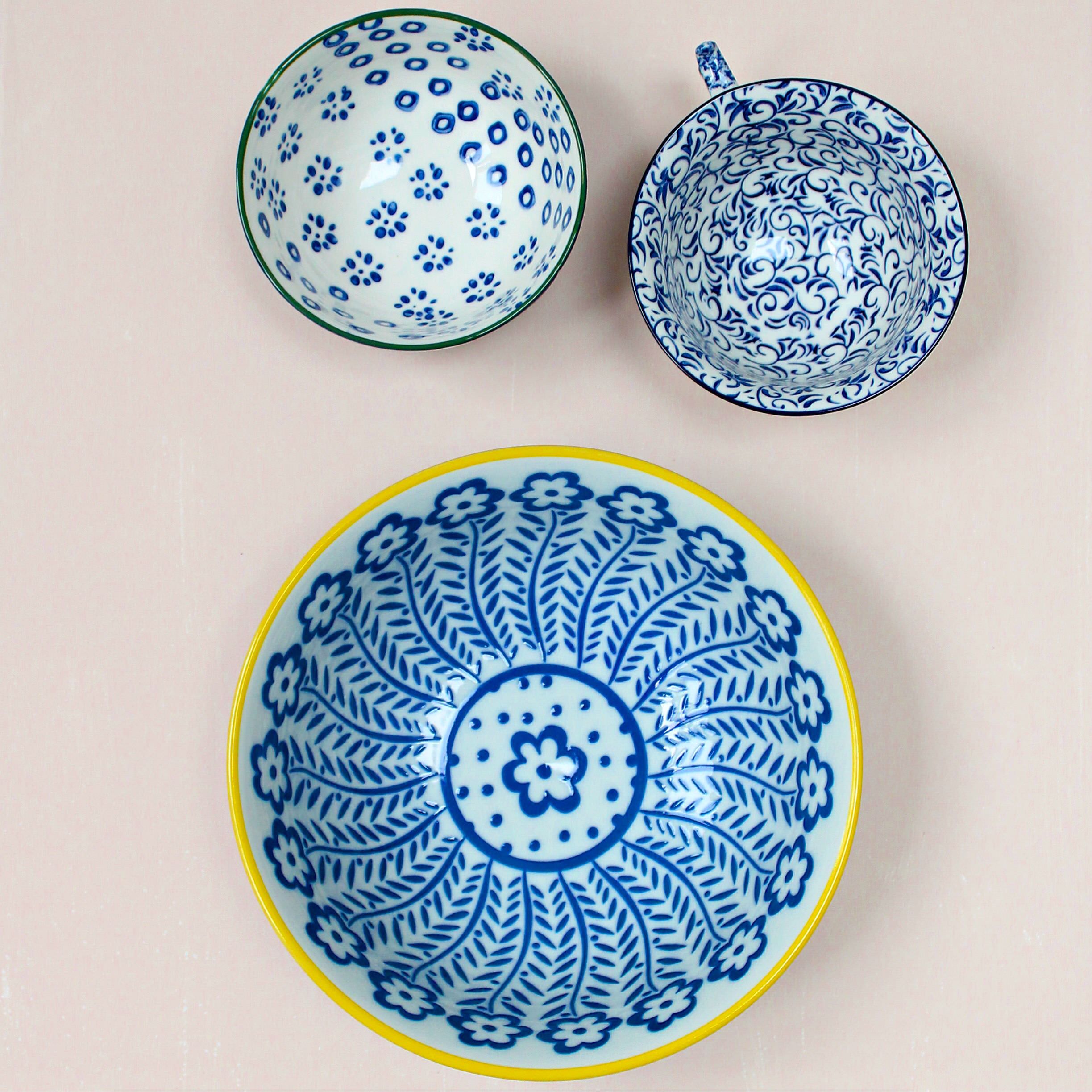
Even white looks great against it. Imagine a wall in Pitch Blue with a shelf full of white porcelain set against it. Nice right?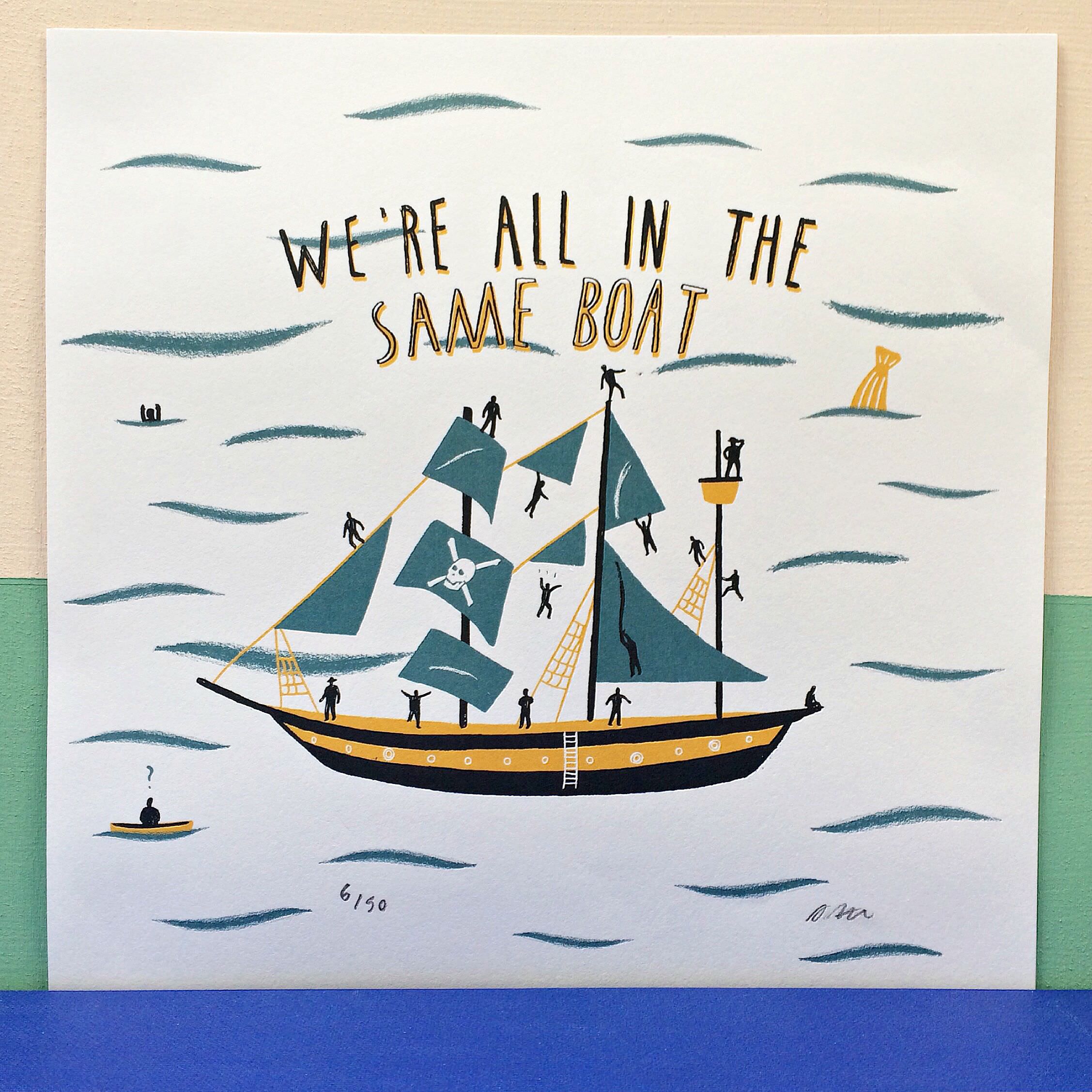 Mix and match the Pink Ground, Pitch blue, Arsenic and Blue Green. They all go together in any combination. I have tried and tested those colours for you at home.
We’re all in the same boat when dabbling in colours. There is fear to combine because of the unknown. My advice is play with colours, get tester pots and create mood boards as I have.
The print above is by Alex Foster.
 Remember to add ‘Gold’ ! Gold goes well with any of these colours I have chosen. I have used gold instead of the yellows I use in my Summer colours.
Gold will bring you sunshine in the Winter as Canary yellow does in the Summer.
I will hopefully, time permitting, be able to design one of my rooms using this mood board. Hope you have enjoyed the post and I would love to hear what colours you intend to use for your Autumn / Winter decor. I have so enjoyed putting together the mood board and vignettes.
Have a wonderful start to your weeks.
( The moodboard and vignettes are styled, photographed and created by me, Geraldine Tan of Little Big Bell. This is a sponsored post in association with Farrow and Ball. All opinions are my own).
Love this gorgeous colour palette created in your mood board perfect for AW15!
Thank you so much. I had so much fun creating it. I can’t wait to start a decorating project using this palette. 🙂
Pingback: Farrow & Ball 1940s inspired wallpaper collection |