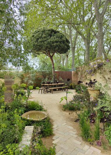
Clerkenwell Design week 2013, London – my picks.

muuto-the dots - 2013This week was Clerkenwell Design week in London. In short, I sifted through the wealth of  design on display and honed in on the products that I found aesthetically pleasing. Here’s a selection of what I liked.

Above are The Dots by Muuto, hanger of coats, but also seen used as door pulls. They usually come in oak, yellow, black and light grey.

Above are this season’s new colours.The contrast of the pastel pink and deep green-grey would look great together in a hallway wall, whereas the red Dots could provide much colour relief for any monotonous interior scheme.

Muuto

The Match tea light holders designed by ‘Form Us With Love’ for Muuto are both visually pleasing yet functional.

I am liking the clean lines of those mint colour coated aluminium lights. The latter would look great in an interior when combined with other pastel shades such as pale pink or yellow.

note-design-studio

This Boet (nest in Swedish) bar stool by Note Design studio is beautiful in its quirky simplicity. It is contemporary in form with a cork seat and slimline tripod legs, yet the blue is one that is reminescent of a vintage furniture era.

form-us-with-love

These giant Button cushions on white metal legs by Form us with Love for Mitab looked inviting. Yes, I was tempted to sit on the display whilst lugging my bag packed full of catalogues and leaflets. The lovely exhibitor told me the interesting story behind the piece – apparently the inspiration came from when the designer visited a textile factory. Confronted by all the wastage in material, the idea for a large patchwork cushion chair was borne.

ivy-shelf-swedese

Lastly, the Ivy shelf from Swedese caught my eye. Admittedly this is not a new product, in the sense that it has already been in the market for a few years. I like the modular concept of the piece, creating a shape that challenges a contemporary notion of clean cut symmetry whilst producing a feature that is both modern and attention grabbing.

That is my round up of Clerkenwell design week. I hope you enjoyed it. I’m off to Berlin today for the Hive conference. So excited. Wishing my lovely readers a wonderful weekend. x

Hannah Jordan – a new talent unveiled

Hannah - Jordan

The other day, I visited one of my favourite shops, Future and Found. There I chanced upon a display of beautiful prints by Hannah Jordan.

Apparently, Hannah had approached Andrea Bates, the shop owner about selling her prints. I’m not surprised that Andrea had agreed, the prints are stunning. They are now rightfully displayed on the top shelf.

Hannah- Jordan -prints

I decided to find out more about Hannah and was delighted when she agreed to a brief interview.  Here goes :

1. Tell me a little bit about yourself and your work.

I have always known that I wanted to work within this industry and took my first steps when I attended Leeds College of Art for two years prior to my university education. I am in my second year of studying BA Textile Design at Chelsea College of Art. Being at Chelsea gives me the freedom to experiment with 3D and 2D forms.

2. How would you describe your style?

My style is quite minimal, and I tend to use a neutral palette alongside an accent colour. I work with various mediums – paper, wood, fabric and combine each medium with a variety of techniques.

Hannah - Jordan

3. what inspires your work?

As far as the inspiration for these pieces goes, I am generally inspired by simplistic geometrics, but not necessarily regimented. I prefer geometric shapes that seem to have formed organically, rather than through fixed angles and measurements. I reflected this in the prints with the slight imperfections to the circular shape and linear designs.

4.Any new work in the pipeline and future plans?

I am currently working on a series of installation pieces inspired by natural light which is based around sustainability. In terms of future plans, i will continue with my studies alongside doing freelance work.

I hope that you have enjoyed this post. Hannah Jordan is definitely a talent to watch.

The Pulse London 2013 – Part 2

Dear- Prudence

Here’s the second instalment from the Pulse Trade show. Introducing you to Dear Prudence, a stationery brand created by Laura Park.

Laura gains inspiration from the woodland nature surrounding where she lives. I like the muted tones she uses and of course those cute animals. The gift wrap above will be on my order list for Christmas.

Anna-Wiscombe

I have known about Anna Wiscombe’s beautifully crafted products for a while. I first discovered and bought her wood cut birds when I visited the Oak studios in Hampstead. Last weekend, I finally got to meet the lovely Anna.

Created using sustainably sourced wood, Anna’s designs are inspired by the Dorset countryside where she grew up.

Chloe-Owens

Chloe Owens, a London-based designer, had a truly eye-catching exhibit on display at the show. Her bright and citrus coloured tea ware complimented the 1960s inspired room-set that she had created. Her embroidered art canvas using vintage fabrics was stunning ( top picture) and I also like those quirky pillows with applique motifs. Take a closer look at Chloe’s designs here.

Hipp

Finally, bringing a bright cheer into your home from Scandinavia is the brand Hipp! Designed by Julia Nielsen, a graphic designer and illustrator from Sweden. Her stall at the Pulse was filled with so many colourful homewares that if I was shopping for myself, I would literally be spoilt for choice! I have selected out my favourites above. That mushroom print is definitely on my wish list.

The weekend is finally here! Wishing everyone a good one and hopefully some lovely warm weather too. x

The Pulse London 2013 – Part 1

Roddy-and-GingerLast Sunday, I attended the Pulse trade show at the Earl’s Court exhibition centre. I was expecting to manoeuvre through a sea of people but instead it was rather calm. Probably because it was Sunday and most of the Trade visitors would be visiting on the weekday.

There was much to see. Despite a vigorous edit of my selection, I was left with quite a few favourites which I will present over 3 blog posts.

First up is Roddy and Ginger. Virginia Armstrong, the lovely illustrator and designer behind the brand was on hand to show me her homeware collection.

Roddy-and-Ginger-1

I liked the Scandinavian influence of her new collection, with its on trend tones of green and monochrome. I was drawn to her ’house’ wallpaper (top image). Virginia told me that the design for this wallpaper was inspired by the white wooden house shelf (very top image) which she found in a thrift store.

Rosehip-1

Next is my fellow blogging friend Silkie of Rosehip. I have previously featured Silkie’s new prints here. Her stall was a visual feast of colour. I love how Silkie is able to produce such a variety of styles and patterns that work so harmoniously together.

Rosehip-2

I was particularly taken by Silkie’s wrapping papers. As my children are frequently attending birthday parties, I’m constantly wrapping gifts. These bright and beautiful designs would certainly ease the monotony of the latter task.

Sian Zeng

I have always admired Sian Zeng’s quirky creativeness. It was unsurprising that the winner of the Elle Decoration young talent of the year award in 2010/2011 would create a stunning new collection.  I simply adore her new wallpaper and bedlinen collection with its accompanying mystical woodland and floral elements.

La cerise sur le gateau

The flashes of neon emanating from La Cerise sur le gateau’s collection was hard to miss. I was interested to learn how its founder Anne Hubert, took the plunge to create her own design company, after much encouragement she received for her ability to customise  whilst working as a photo stylist.

Anne’s collection has been likened to a re-interpretation of classic French household linens but with a modern twist – Toile de Jouy and Liberty prints with a touch of humour.

Charlotte-Day

Charlotte Day was one of the 17 graduates who beat the hundreds of applicants chosen by Central Saint Martins college of arts and design, to make their debut appearance at the Pulse. The concept behind her beautiful home sewn peg bags is to engage one in craft,  endearing the end product to its creator. The floral designs have been hand drawn and printed using the latest printing technologies.

Lotta-ColeLast but not least, the handmade homewares from Sweden and England created by Lotta Cole. I met Lotta at the show and she explained to me how her business is truly a family one.

Lotta creates homewares inspired by her home surroundings, a farm and forest owned by her great great grandfather in Sweden since 300 years ago. This forest of Juniper, Birch and Pine provide ample raw materials for Lotta’s work and has now been passed down to her father.  He was also the one who has taught Lotta how to work with wood since her early childhood.

I hope you have enjoyed this first edit of the show. I will report back with more in my next posts. wishing all a wonderful week. x

Monochrome decorative accessories for the home

kahler -marimekko

Decorating only in black and white takes a considerable amount of restraint. Each time I have tried, a pop of colour would inadvertantly appear.

tid-clock-design-house-stockholm

The fact that most mundane everyday objects come in colour, adds challenge to this strict discipline. With kids around, I can seriously forget a monochrome palette.

design-letters-alphabet-cup-vase

But then again, I like colour! I think pops of colour serves to enhance. I thought I’d share with you a few key monochrome pieces I have recently acquired.

Top image : Striped Omaggio vase from Kahler ; Small egg cup by Marimekko.

Middle image : Tid clock from Design House Stockholm.

Bottom image: Love letters print from One must dash ; Alphabet pot from Design Letters.

Wishing all a wonderful weekend ahead. x

Happy Bank holiday Monday.

Trays- by- Hay- of- Denmark-Little-big-bellIt is Bank holiday Monday today. I have often wondered the origins of Bank holiday, a public holiday in the UK.

So it seems that prior to 1834, the Bank of England used to observe the 33 saints’ days and religious festivals as holidays but this was later reduced to 4 days, including May day, All Saint’s day, Good Friday and Christmas.

It was not until 1871 that unsurprisingly, a banker by the name of Sir John Lubbock had introduced the Bank holiday act specifying more days of rest.

Good for Sir John I say! A well rested and contented worker is a productive one – I just realised this is coming from someone who works a seven day week! At least I have today off to recuperate and start afresh for Tuesday.

I leave you with a picture I took and styled of items from my favourite brand, Hay of Denmark. In line, with today’s predicted scorcher, I have presented my neon orangy-red and yellow Hay Kaleido trays and brass scissors. The brass bowl is from Skultana and the  pen from Midori.

Hope everyone has a wonderful Bank holiday Monday and for those who don’t have Bank holidays, a wonderful week ahead. x

Interview with Jenny Wallmark of Wallmark formstudio

Today, I have the pleasure of featuring an interview with Jenny Walmark, an illustrator and designer from Sweden. I like the simplicity of her designs combined with a striking palette of pastels, deep blues and ochre yellows. Here goes :

1. Tell me a little about yourself and your work.

I live in a town called Sundsvall in the middle of Sweden. I work with communication, design and illustration in my company Wallmark formstudio. I get commissions from businesses and magazines, and I also market my products at re-salers and in my own web shop Namntavla.

The commissions include children’s book illustrations, illustrations to articles, textile patterns and products such as calendars. I have studied Graphic Design & Communication at Berghs School of Communication in Stockholm. I have a Master of Science in Business, Economics and Communication.
I have been creative all my life. I have always been painting,drawing, sewing and so on. Today I usually design my sketches with pencils and ink and then I colour them in my computer with a programme called Illustrator.
blaklocka_eng
2. How do you describe your style?
My designs are playful and take imaginary shapes with an interesting combination of colours and sometimes just simple and decorated illustrations for children that can be enjoyed by adults and vice versa. I hope that people feel happy when they see my design. I would like to design things that people use everyday.
guldgren_eng

3. What inspires your work?

Nature, my children, books, movies and art are sources of inspiration. When I discover an interesting combination of colour or pattern I save it and use it when it fits into one of my projects.
I love patterns! The other day when I looked out of the window for a brief moment, the shapes of the clouds instantly gave me an idea for a pattern! The nature is amazing.
Rosa_eng

4. Any new work in the pipeline and future plans?

I get new ideas all the time and if your interested you can check out my websites and blog, Wallmarkformstudio and namntavla for new posters and products. I sell my products at nordicdesigncollective and in my own shop.
Bla_eng

Urban Flower company

Urban Flower Company

Yesterday afternoon, after the school run, I decided to visit my local florist, Urban Flower Company.  In part due to the need for beautiful blooms to cheer up a fickle day of rain but mainly to show support to a fellow creative who suffered a recent setback.

This setback was thousands of pounds of damage caused when a police car careered off the road during a chase and went through the shop front. You can read more about it in this Evening Standard article. Luckily, no one was seriously injured.

Now boarded up in the front, the business has continued to trade via a side entrance at the rear of the shop. I believe the local community have rallied with support.

The Urban Flower Company - I have often admired the flowers stocked in this store alongside the talented creativity on display. The owner is 27 year old Matthew Richardson, who in a previous interview for Ham and High newspaper was quoted as saying he wants to be the face of flowers like Jamie Oliver is to food. He is definitely on that path as his store is popular with numerous celebrity clients and wedding bookings.

I went into the store with a simple glass bottle (picture at the very top) and within 2 minutes, Matthew had created the beautiful spring display for me in varying tones of blues – so perfect.

I also loved the Peonies and bought the pink one above, beautiful on its own in a simple glass vase.

I will definitely be making more regular visits in the future and hopefully be able to show you what new creations Matthew comes up with.

Wishing everyone a wonderful weekend. x

The Flamingo trend

flamingo trendI remembered Holly Becker from Decor8 and Steffi of OhhhMhhh once told us at Blogging your way studio, if you spot something in 3′s, you have yourself a trend. I was subconsciously aware of the flamingo appeal (not sure where from, possibly Pinterest or Instagram) but then they started popping up in places I visited or magazines that I read. Although not yet clearly visible everywhere, I wonder whether there will be an explosion of pink this Summer?

Above are the Flamingos that I have spotted and liked:

1. Flamingorama print by Aida at Nelly Duff ; 2+3 Flamingo ceramics from Mirasanto and  4. Flamingo Zatchel from Oliver Bonas.

Hope you are all having a wonderful week. Despite my previous post about the potential poor weather, today has surprised me with a wonderful warmth. Those Flamingos are getting me in the mood for Summer. x

Related Posts Plugin for WordPress, Blogger...